The Nathan James Review – A Good Furniture Store
Glory-Anna Oshafi
Nathan James is a notable e-commerce store specializing in boho, mid-century, and minimalist furniture and lighting. It hosts its e-commerce store on Shopify Plus and offers a range of stylish, affordable, and easy-to-assemble furniture. We proudly present our The Nathan James Review to show you what elements build their success.
With over 10,000 reviews on the site, the Nathan James store is often praised for its high-quality design and aesthetically pleasing and practical furniture.
When you visit the site, you’re immediately greeted with discounts on several furniture pieces. This affordability and ease of assembly have helped them build a strong brand identity.
Now, let’s explore the individual aspects of the Nathan James store that make it unique.

The Nathan James Store Features
Different aspects of the Nathan James store contribute to its overall appeal. We’ll review each of them in subsequent headings and rate them too.
Product Descriptions and Collections – 9/10
The Nathan James store includes a comprehensive product description of its furniture on each product page. Let’s examine them under various metrics:
1. Clarity and Descriptiveness
The product descriptions vividly highlight the features of the furniture and explain how some essential features benefit users. For example, in the description section for the upholstered 5-seat sectional sofa, “Plush back cushions” is listed as a sofa feature.
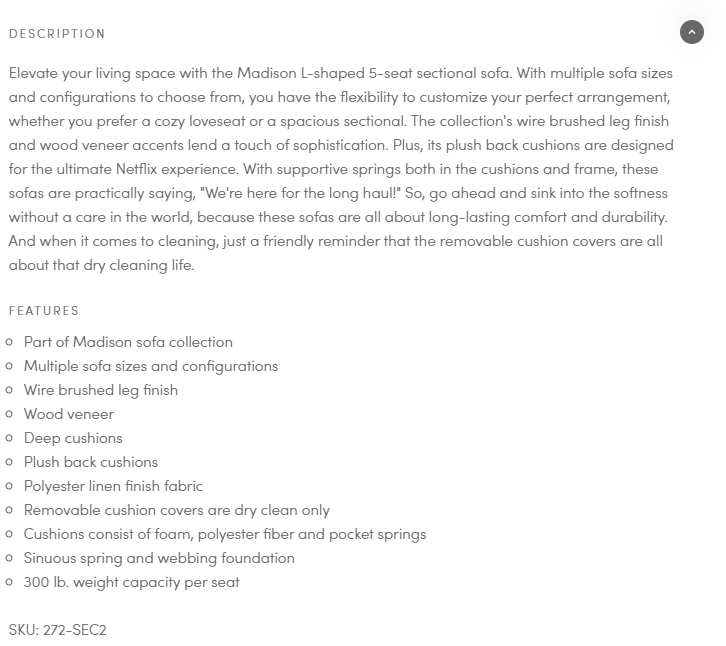
But to further emphasize the need for the plush cushion feature, the description shares that they’re great for comfort, especially during activities like Netflixing. Thus, the company doesn’t leave its customers wondering how the sofa features benefit them.
2. SEO vs. Readability
Based on the sofa description in the image above, there don’t seem to be many relevant keywords in the product description. We see a few keywords like “cozy loveseat” and “removable cushion covers,” but they’re not prominent. The list of features section also sports a few possible keywords.
It appears that the store prioritizes readability and valuable content over SEO in its product description.
We ran a Google search using the product name “Upholstered 5-Seat Sectional Sofa,” which could also double as a keyword, and the store ranked second on the SERP. Not bad for SEO. See the image below. 👇
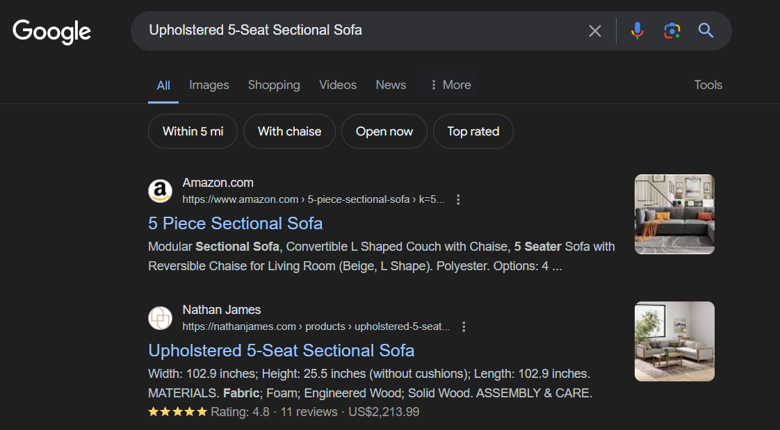
3. Creativity and Branding
In terms of creativity and brand voice, Nathan James has them covered. The store creatively brands its collections with easy-to-recall names in the product description. For example, there’s a sofa called “the Madison L-shaped 5-seat sectional sofa” and a coffee table called “the Kendall nesting coffee table,” among others.
The creative names will help customers remember specific furniture pieces, especially during referrals.
4. Organization of Collections
The store’s product organization is top-notch. We found furniture categories based on their home usage. These categories are easy to locate with the navigation bar at the top of the website homepage.

You can also shop based on the type of furniture you want. There’s a category for tables, office supplies, lighting, sofas & couches, and bookshelves. When you visit the site with a shopping intent, you’ll immediately find a category representing your needs. To browse their entire collections, there’s a category labeled “All,” but if you want only items on sale, clicking the “Sale” tab will show you all discounted products.
This level of organization contributes to creating a good user experience for visitors.
5. Visuals
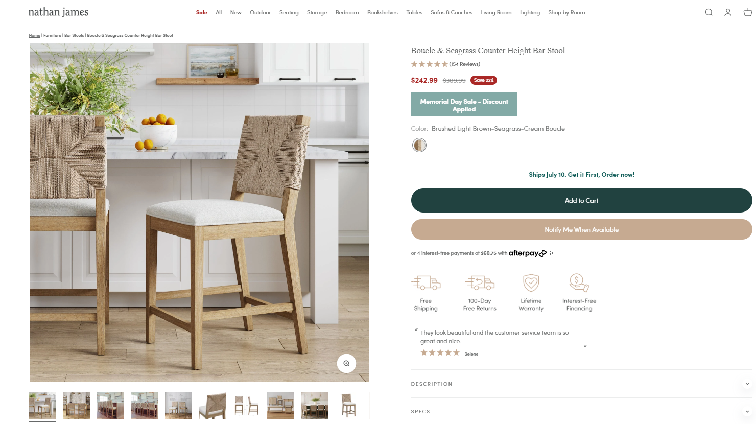
The e-commerce store also uses high-quality images, which works in its favor. Each product description page contains high-resolution images that visually showcase the furniture’s specifications. These images also display creative angles that elevate the product’s features, making them more appealing.
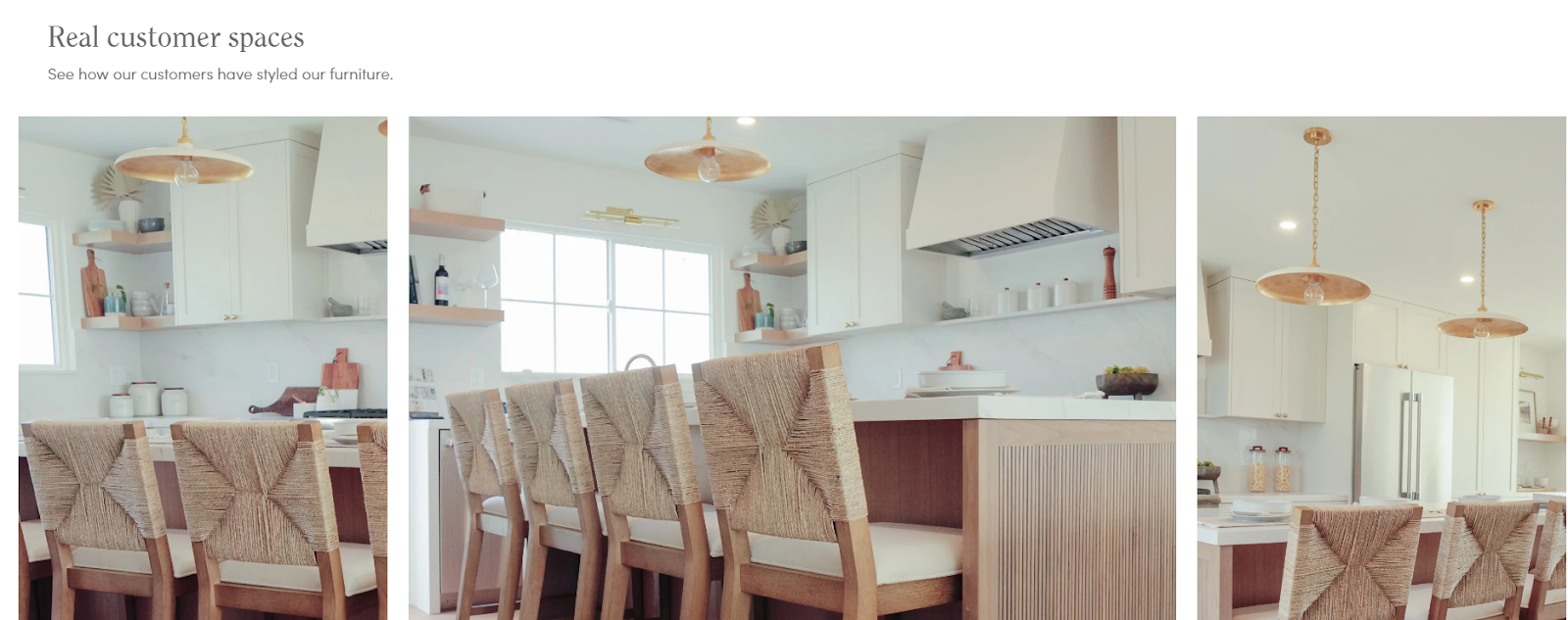
The product pages have a “Real Customer Spaces” section that showcases more images from customers who have previously purchased the product. This section helps customers make informed decisions about the product, shows them ways to style it in the home, and offers social proof to uncertain buyers.
User Experience – 8/10
The Nathan James website design is clean, modern, and visually appealing. The page’s assets are carefully placed without distracting visitors from the products, and the colors on the homepage are predominantly distinct from the products displayed.
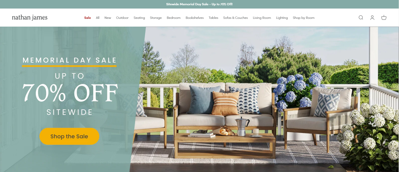
The e-store’s homepage above has visibly intuitive navigation. The menu is spread out at the top of the page, showing different categories for shoppers to choose from. As you scroll down the page, more options appear on how to shop.
The intuitiveness contributes to the user experience. You don’t need to rack your brain to find something on the website. Although the font size is a bit small, the ease of finding what you’re looking for makes up for it.
Another important win for the Nathan James store is its fast loading time. Despite its numerous high-resolution images, it doesn’t compromise on loading time. This enhances user satisfaction and reduces the bounce rate.
Whether you’re browsing on a smartphone, tablet, or laptop, the site’s responsive design makes the user experience enjoyable.
Customer Service and FAQ Page – 8.5/10
If you’re a customer looking for help on the Nathan James website, you’ll be spoilt for choice. You can reach them via email, text, phone, and WhatsApp, giving users convenient options. However, support is not available 24/7, which limits fast response outside business hours.
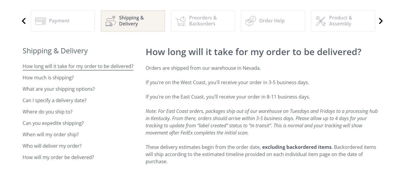
One major concern about the store’s support and assistance is that you may not find help immediately. It has a dedicated help center, which is great, but you need to scroll to the bottom of the site to locate it. The help center has a variety of sections handling different FAQs, from payment to shipping and even product assembly.

Beneath the FAQs, you’ll find contact lines for different support channels and their availability. The information is presented simply, which is valuable for confused or disgruntled customers who need immediate assistance.
Generally, the store may offer useful and valuable support for its customers, but there’s still room for improvement.
Return and Shipping Policies – 9/10
The shipping and delivery expectations are clearly stated on the product pages, making it easier for customers to shop confidently.
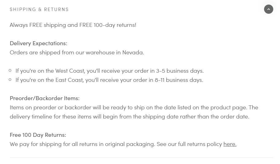
The return policy, however, isn’t fully stated on the product page. For easy navigation, there’s a link to another page that contains a detailed returns policy embedded into the product’s shipping information.
If customers need further help, the FAQ section for shipping and delivery also provides detailed answers to shipping and returns concerns. For more clarity, the contact lines are open during business hours.
Notably, Nathan James offers free shipping on all their furniture. Plus, they cover the shipping expenses for returns as long as they’re returned in the original packaging.
Nathan James’ return and shipping policies are customer-centric and transparent. The 100-day return policy is particularly generous, giving users ample time to decide if they’re satisfied with their purchase.
Promotions and Discounts – 8/10
Nathan James is big on discounts and promotions. At the time of this review, they’re offering up to 70% discount on most of their pieces. They display these discounts prominently across the website to attract shoppers’ attention, as it implies they’ll enjoy huge savings.
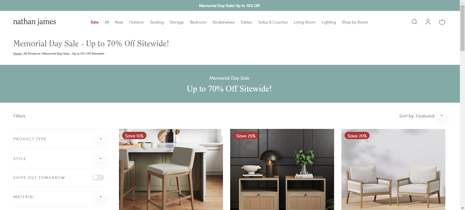
On the homepage, shoppers can easily spot these promotions on homepage banners. On product pages, you’ll find sales tags on products, markdown pricing, and strikethrough discounts. There’s also a page specifically dedicated to discounted items.
This variety of discount marketing techniques helps foster a sense of affordability that endears price-sensitive shoppers to the brand.
Special Features and Innovations – 7.5/10
One special feature of Nathan James’ furniture, often mentioned in reviews, is the ease with which customers can assemble furniture. This is possible mainly because the website provides e-manuals and visually descriptive directions showing customers how to assemble their furniture pieces.
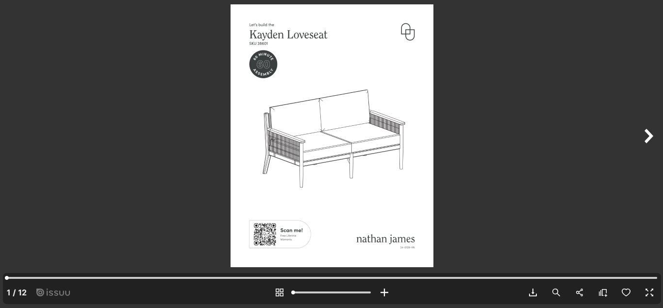
Additionally, adding customer reviews to every product page adds a layer of authenticity to the brand, making it easier for visitors to trust and engage with it.

Another special feature we noted is their integration with Afterpay (a third-party financing service) to provide flexible payment options for shoppers. If customers don’t have enough funds to buy a particular piece of furniture, Afterpay is available for installment payments, though it comes with an interest.
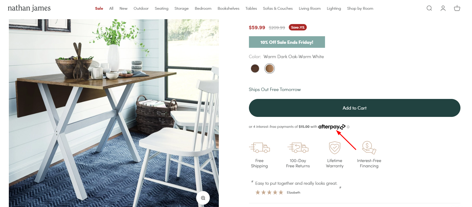
Shoppers on a budget can use the installment plan option to buy furniture immediately, with the payment spread across a particular period.
Strengths Behind The Nathan James’ Success
Nathan James stands out for creating an enjoyable shopping experience that begins when you visit the website. These are a few prominent strengths on display:
- Intuitiveness and Ease of Use
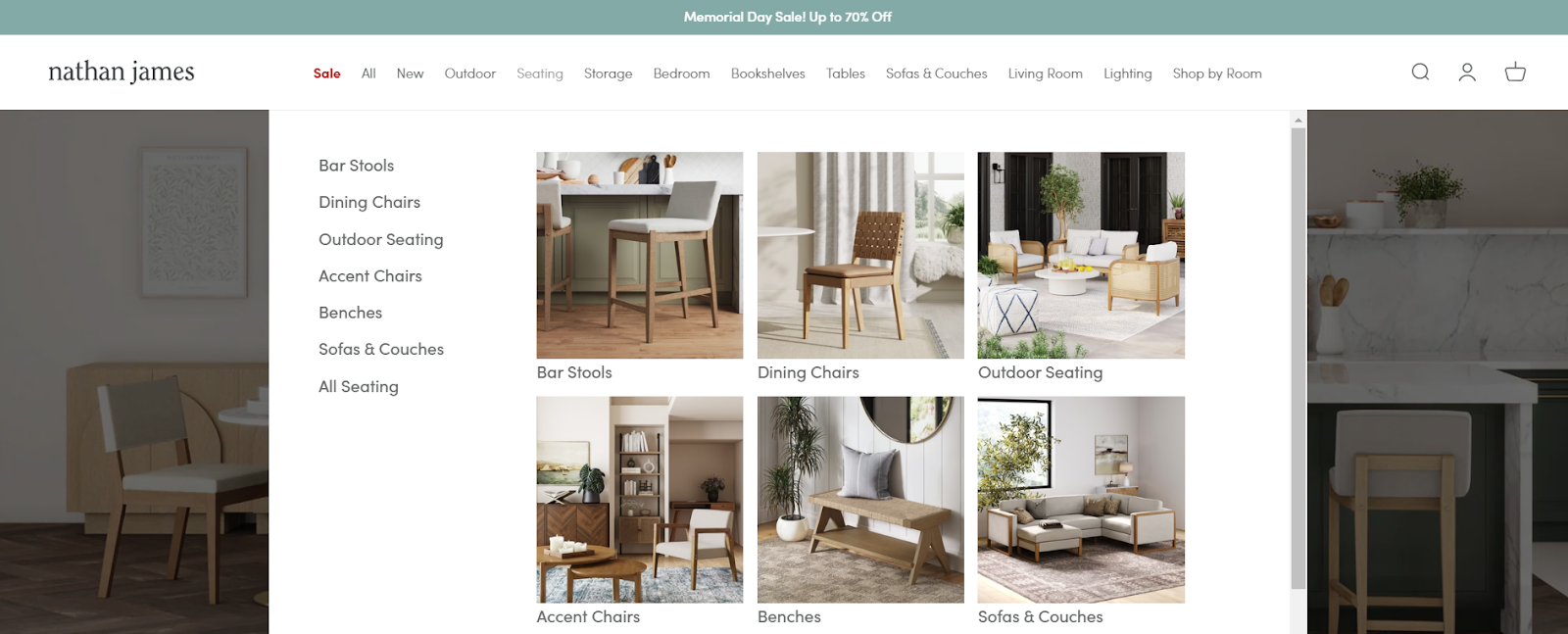
The clean website design has a calming effect, while the visible discounts compel users to make a purchase. Then, the intuitive layout makes it easy to find whatever you’re looking for. Scrolling through the navigation bar, there are even drop-down menus that help users locate their furniture needs quickly.
- Visual Product Appeal
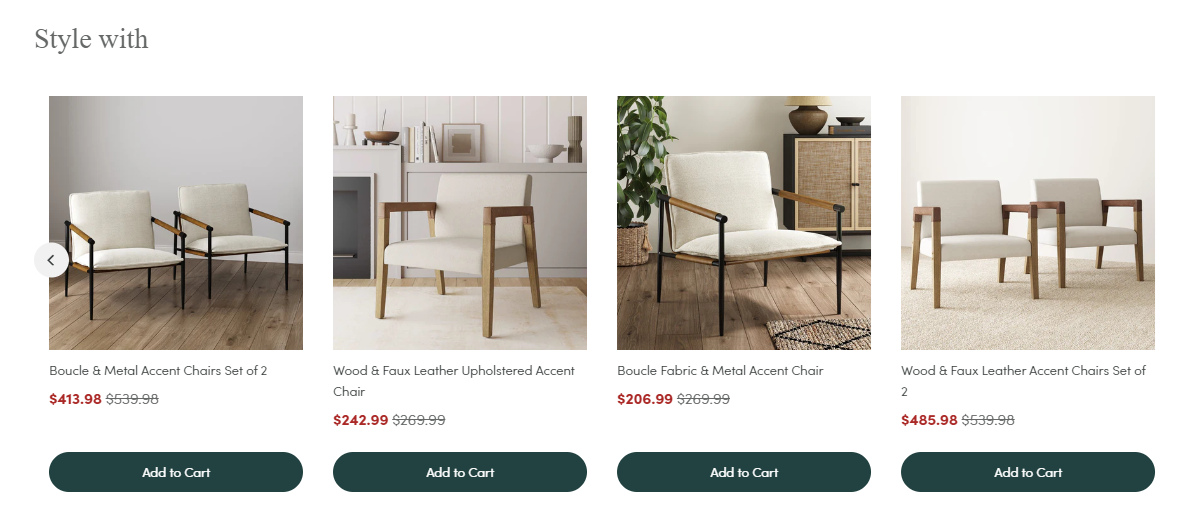
The high-quality images on product pages make it easy to visualize the furniture in a space. They even suggest furniture pieces to accompany the purchase. For example, if you’re getting a coffee table, there’s a “Style with” section that showcases other furniture pieces that can complement it.
- Clear Information
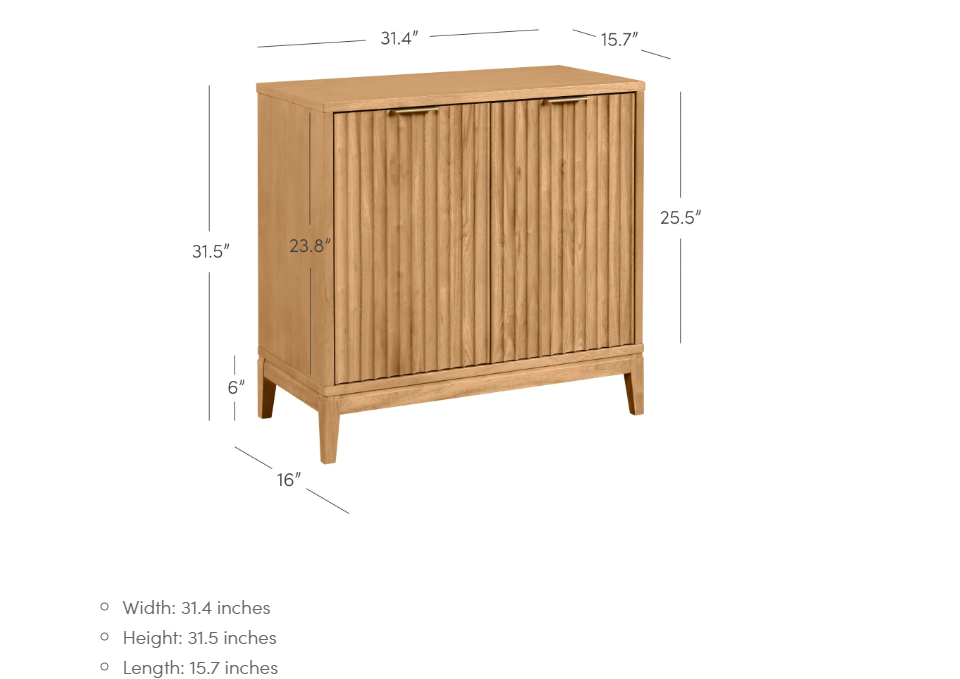
The site provides product descriptions that educate buyers on how each unique furniture feature contributes to the functionality and aesthetic of the product. Shoppers can tell where it’ll fit in their space because the product page also contains information about the furniture’s specifications.
- A Sense of Affordability
Another strong feature of Nathan James’ site is its sense of affordability. Visitors can tell that they’ll get value for their money and enjoy huge savings with the heavily discounted pricing. See what this reviewer had to say about her purchase.
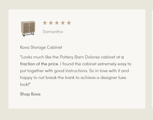
Let’s not forget the ease of assembling the furniture, which is a common praise from satisfied customers. Their generous return policy and free shipping showcased on product pages also help place them high on the scale of brands that care about their customers.
Growth Opportunities for The Nathan James Store
Although Nathan James is already an excellent furniture brand, there’s still room for growth in a few areas that can help to skyrocket sales and improve the overall customer experience. Let’s see a few:
1. Customer Loyalty Programs
Discount marketing is a trusted way to increase sales, but to keep customers coming back, introducing a loyalty program is effective. Offering loyalty programs helps increase customer retention and engagement, which can drive more traffic to the website.
2. Social Media Integration
Speaking of website traffic, we also suggest that they integrate their website with visual social media platforms like Instagram or TikTok for two reasons. One, showcasing products on their social media using social media business tools will drive more traffic to the website and boost sales. An Instagram storefront, for instance, allows more people to engage directly with images of the furniture pieces from Instagram and then redirects them to the website to complete the transaction.
Two, showcasing user-generated content from their social media platforms on the website also serves as social proof, encouraging more visitors to buy.
3. Virtual Reality or Immersive Videos
Utilizing virtual reality or immersive videos of the furniture is an easy way to convince buyers to make the purchase. Virtual showrooms allow customers to try the product before they buy. They can see furniture in a realistic setting, helping them make better decisions about scale, style, and fit.
With a virtual reality or immersive video feature, customers will make more decisions they’re satisfied with, reducing the need for returns and encouraging return purchases.
4. AI Chatbot Support
Integrating an AI chatbot on the website will further improve visitors’ shopping experience.
Here’s how:
It reduces the need for customers to navigate to the FAQs page (that’s already inconspicuous) or wait for business hours to get answers to their queries. Fast response time is an integral part of customer satisfaction; integrating a well-trained AI chatbot on the site is one of the most effective ways to achieve that.
Final Rating
Ratings Breakdown
- User Experience: 8/10
- Product Descriptions and Collections: 9/10
- Customer Service and FAQ Page: 8.5/10
- Return and Shipping Policies: 9/10
- Promotions and Discounts: 8/10
- Special Features and Innovations: 8/10
Overall Rating: 8/10
Nathan James excels in delivering aesthetically pleasing, practical, and affordable furniture. Their Shopify Plus store features clear product descriptions, creative branding, and a well-organized collection that enhances user experience. High-quality visuals and responsive design ensure seamless browsing on any device. With strong customer service and generous return policies, Nathan James creates a reliable and satisfying shopping experience despite minor areas for improvement in support availability and font size. To address these gaps, Juphy can enhance the overall customer experience with features like 24/7 support and automated order tracking.
What Can Juphy Do for Your Shopify Store?
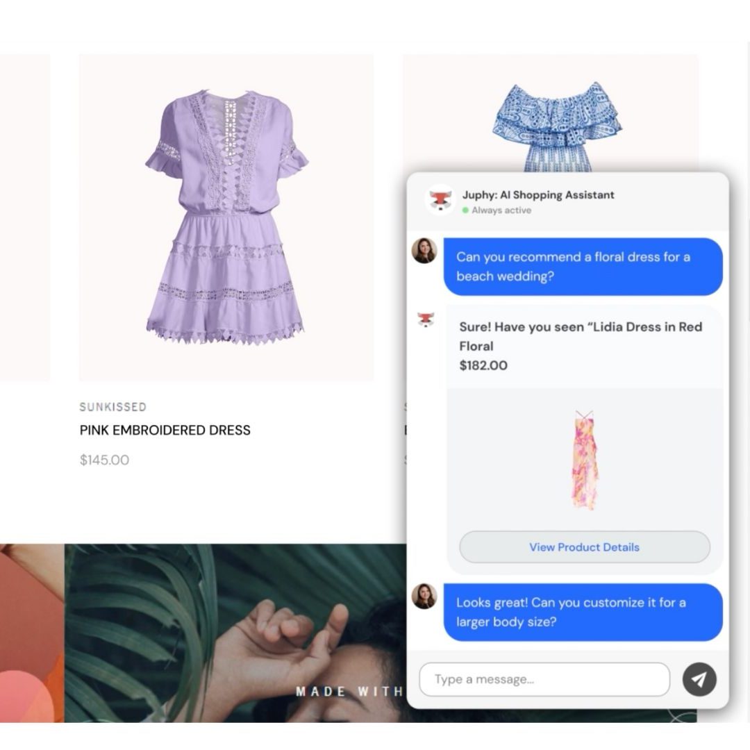
Personalized Shopping Experience
Juphy’s AI-powered Agent, featuring the ‘Built for Shopify’ badge, ensures customers receive personalized product recommendations based on their browsing history and preferences. This feature helps customers find what they need quickly and enhances their overall shopping experience, increasing the likelihood of conversion.
- Tailored product suggestions
- Improved customer satisfaction
- Enhanced shopping experience
Automated Order Tracking
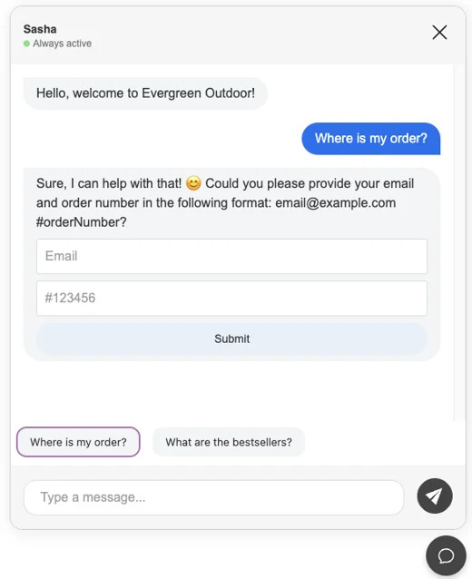
Integrating Juphy into your Shopify store allows you to automate order tracking updates. Customers receive real-time information about their orders, reducing the need for manual inquiries and improving overall satisfaction.
- Real-time order updates
- Reduced customer inquiries
- Increased efficiency
24/7 Customer Support
With Juphy, you can provide 24/7 customer support, ensuring your customers receive prompt responses to their queries at any time. This continuous support enhances customer trust and loyalty.
- Around-the-clock assistance
- Improved customer trust
- Enhanced customer loyalty
Increased Sales and Reduced Cart Abandonment
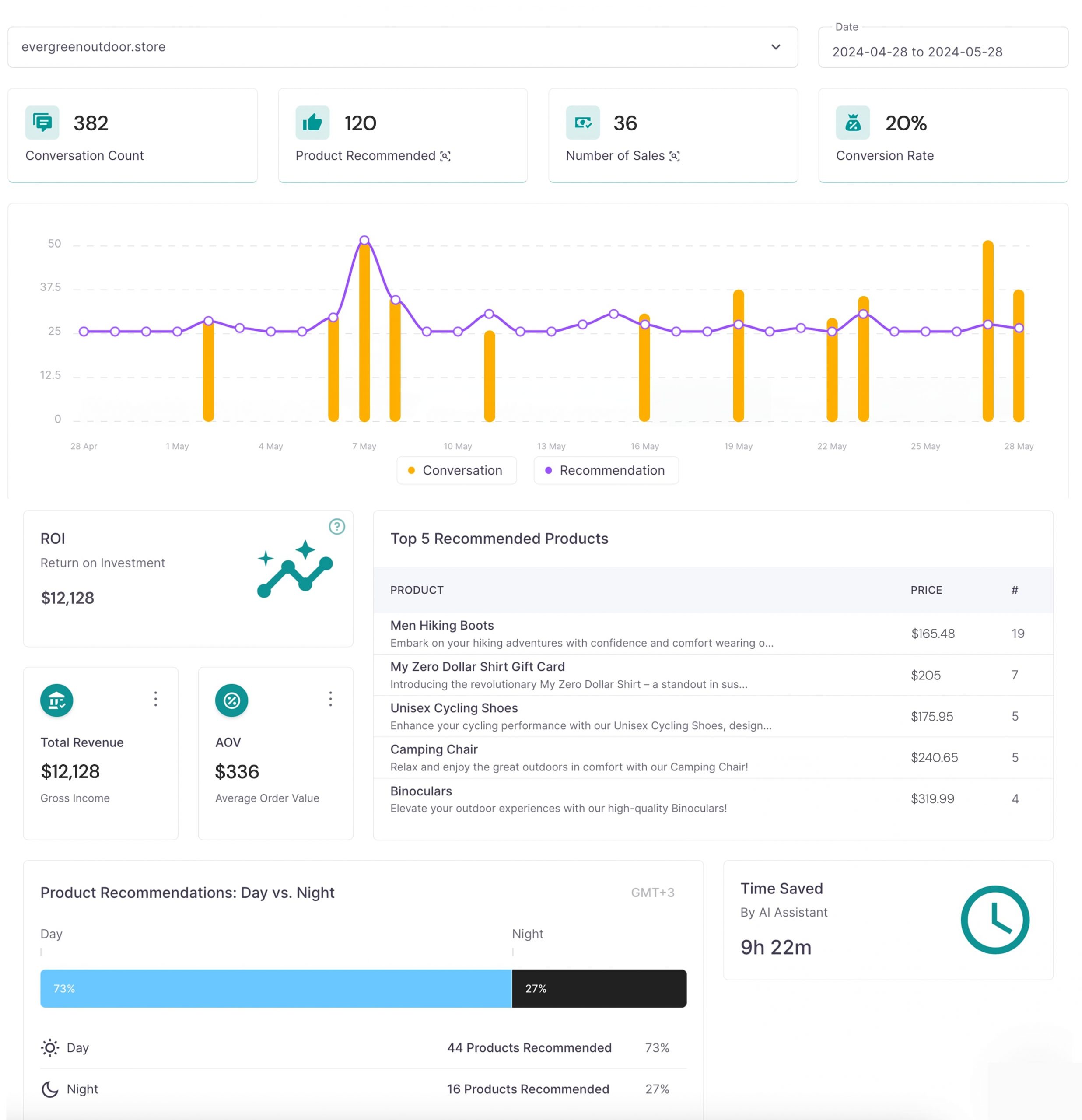
Juphy’s features aim to reduce cart abandonment by providing timely reminders and assistance to customers during the checkout process. This proactive approach helps secure more sales and boosts your store’s revenue.
- Timely checkout reminders
- Reduced cart abandonment
- Increased sales and revenue

