7 Elements That E-Commerce Websites Should Focus on
İpek Aktaş
Does anybody know the number of e-commerce websites today? We’ve lost count!
Now that creating an e-commerce website is easy and there are countless e-commerce websites online, businesses should understand the details that make a difference.
Today, we will tell you about the elements that you should focus on while making your e-commerce website so that it stands out and brings more visitors.
TL;DR: The article outlines seven crucial elements for e-commerce websites to focus on for success, including establishing trust, ensuring visual appeal, providing intuitive navigation, offering detailed product information, enhancing SEO and online visibility, developing a strong branding and identity, and optimizing the site for conversions.

What Are E-Commerce Websites and Why Are Some Website Elements More Important?
Having an e-commerce website is like having a shop open 24/7. Is it the weekend? Is it a national holiday? Is there a pandemic? It doesn’t matter. Your website is there as long as there is an internet connection.

The only disadvantage is that currently, there are countless of them. There are so many e-commerce websites, and that’s why you should know the critical elements that will help you to take a step forward.
Website elements can be categorized as structural elements and content-related elements.
Some are more important than others since some elements directly affect the customer experience.
For example, product catalogs, shopping carts, and payment processing are all essential for completing a purchase. These elements are important because customers are more likely to abandon their cart and leave the website if they are not working properly.
1. Establishing Trust
It always comes to trust when the topic is an e-commerce website. Establishing trust is the first thing you should focus on about your online shop.
To stand out among a sea of scammers and fake stores, you need to have a trustworthy site created with all necessary security pages, policies, and certificates, if there are any.
For example, you’ll probably see those policies listed on the footer of any trustworthy e-commerce website, like Farfech.

Or you must have seen sincere “About Us” pages to share the story and, more importantly, the identity behind the brand.

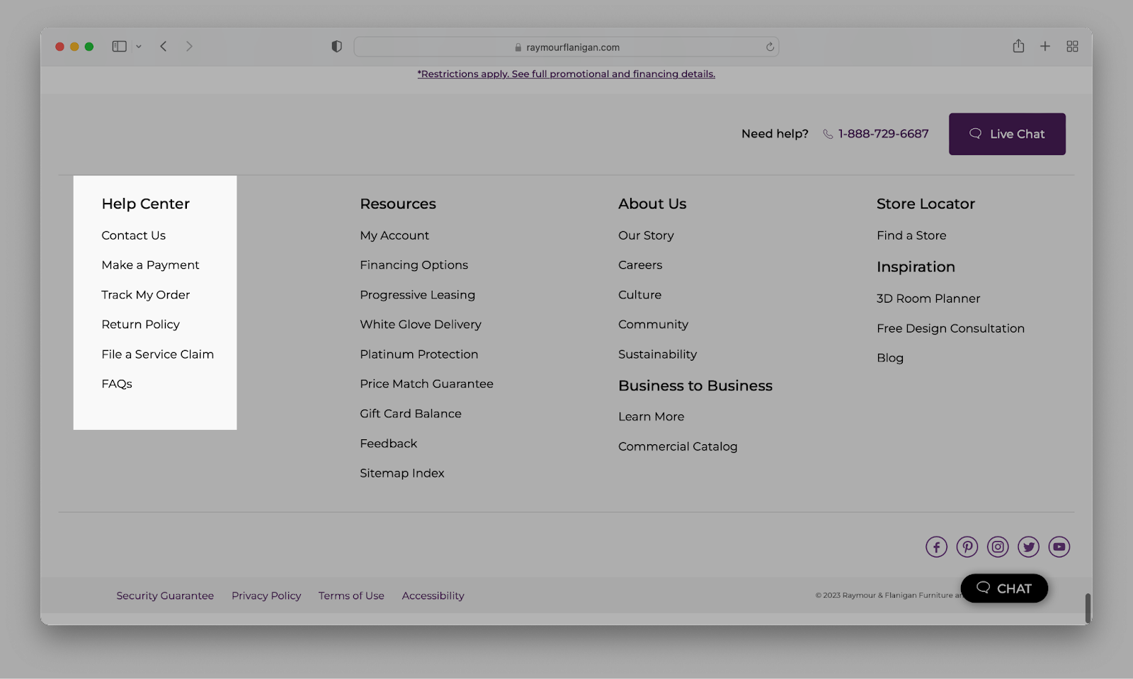
In another example from Raymour & Flanigan Furniture, you can see that e-commerce businesses are trying to make themselves reliable by making it easy for customers to contact them, make a payment, track their order, learn the return policy, and file a service claim and review FAQs.
Showcasing Brand Promise on Homepage
When a customer lands on your e-commerce website, they want to know what sets you apart from the competition.
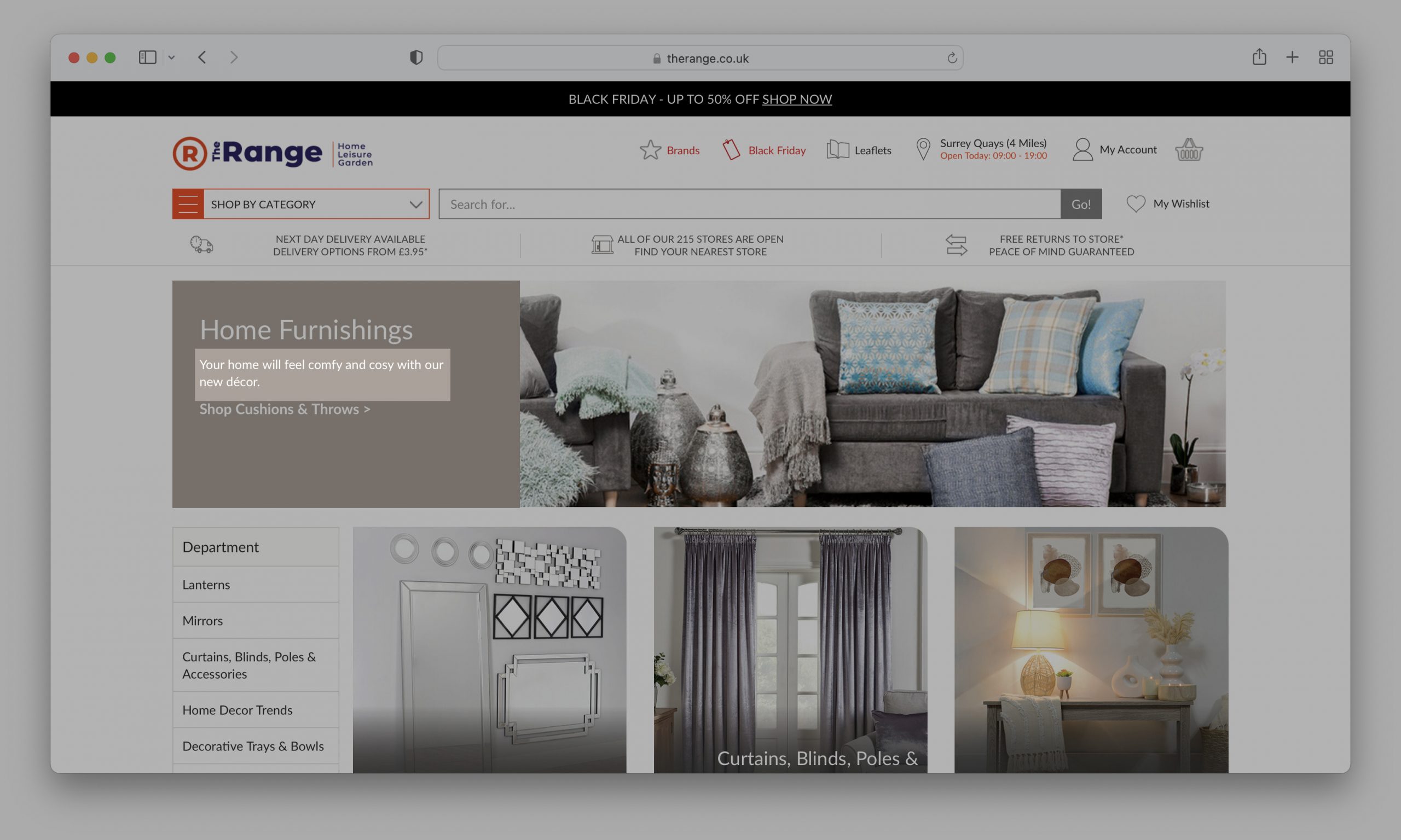
By prominently displaying your brand promise on the homepage, you instantly communicate your values and commitment to customer satisfaction. This tactic not only helps to establish trust but also differentiates you from other businesses in the market.
Your brand promise should be clear, concise, and compelling. It should highlight how they can benefit the customer.
Whether it’s offering high-quality products, exceptional customer service, or a hassle-free return policy, make sure that this promise is front and center on your homepage.
By showcasing your brand promise on the homepage, you are telling potential customers that you value their trust and are dedicated to delivering on your promises.

This transparency helps build credibility and encourages customers to feel confident in purchasing from your e-commerce store.
Displaying Customer Reviews and Testimonials
What is more reliable than experience? Displaying customer reviews and testimonials can help you establish trust for new customers.
Besides getting an idea of what your product is like, readers can see that your products/services are legitimate and your business is reliable.

User-generated content (UGC) is the social proof of your business and is a great help for creating a feeling of trust.
In fact, according to e-commerce statistics, 1,200 e-commerce websites using user-generated content have found an increased conversion rate of 3.2 percent.

Bershka even has a full catalog of User-generated Content (UGC).
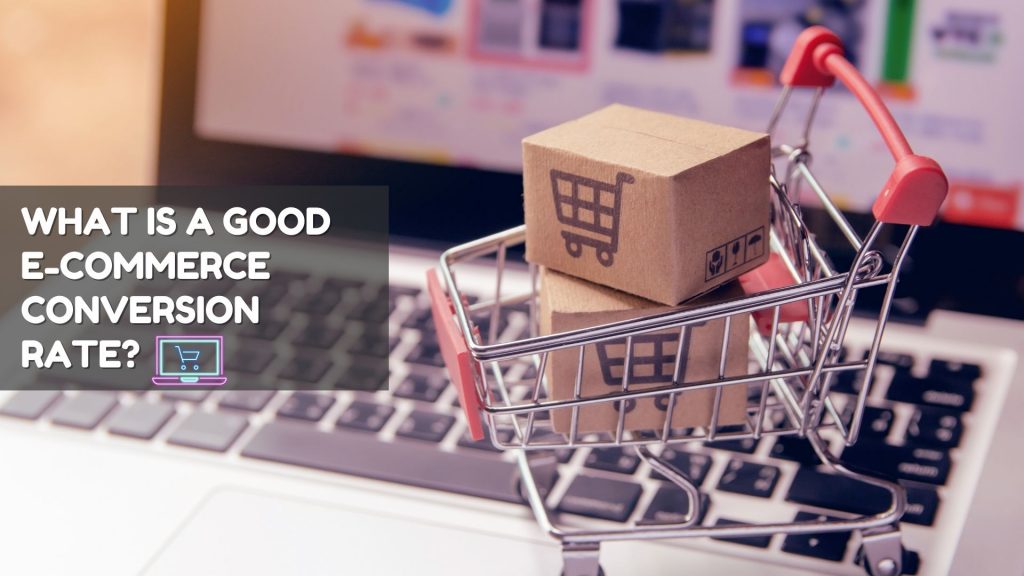
Further Reading: Learn the average conversion rates of different industries.
2. Visual Appeal and Design
Consider this: when you land on a website, what catches your eye first? The answer often lies in the visual appeal and design. It’s not just about first impressions; it’s about creating a memorable experience that keeps visitors coming back. How does your site measure up in this regard?
When it comes to e-commerce website design, visual appeal is often the deciding factor for users to stay or leave.
A visually appealing website grabs attention and creates a sense of trust and professionalism. Keeping up with modern design trends and using white space effectively can create an engaging and successful online shopping experience.
Using White Space Effectively
One crucial aspect of modern design is utilizing white space effectively. White space refers to the empty spaces between elements on a webpage.

Contrary to popular belief, white space is not wasted; instead, it is a powerful tool for enhancing readability and highlighting key elements.
Using white space wisely in their website design allows e-commerce businesses to create a balanced and clear layout that helps users focus on important information and products.

Plus, an aesthetically pleasing website not only attracts customers but also improves user experience. A well-designed interface and intuitive navigation make it easier for users to quickly and effortlessly find what they are looking for. This approach ultimately leads to higher conversion rates and customer satisfaction.
Businesses can create visually stunning websites that capture attention and provide a seamless user experience that keeps customers coming back for more by implementing modern design trends and utilizing white space effectively.
Most internet users can’t stand complex navigation and are likely to give up after a minor inconvenience.
For example, Pull&Bear highlights the menu when mouseover, so it makes it easy to navigate and understand the menu, which creates a good user experience.

User experience should always be one of your priorities while designing your e-commerce website, and remember, user-friendly designs always win.
Most internet users intuitively find their way on a website, so your e-commerce website structure should be easy to navigate without any problems. When users can easily find what they’re looking for, they’re more likely to stay on your website and make a purchase. To ensure optimal navigation and user experience, consider working with a web development services company that specializes in creating user-friendly e-commerce platforms.
For example, even if it is a common practice, and Bershka is a good e-commerce example, I also don’t love such navigation structures that look too complex.

Bounce rate is the percentage of visitors who leave your website after viewing only one page. A high bounce rate might mean that your website is difficult to navigate or that users aren’t finding what they’re looking for easily, so they leave.
Navigation structure is also important for SEO improvement. A well-structured website will be easier for search engines to crawl and index, which can help you rank higher in search results pages (SERPs).
As long as you use clear and concise category names, organize the categories in a logical way, use breadcrumbs, provide multiple ways to navigate, and pay attention to other details about navigation, you can create an intuitive navigation structure that users will easily use!
Providing a Seamless Checkout Process
When users have a positive experience on your website, they’re more likely to return and make future purchases. Intuitive navigation is one of the most essential factors in creating a positive user experience, but you should also ensure the checkout process is easy and seamless. Many people are likely to change their minds easily when the checkout process is complex or long.
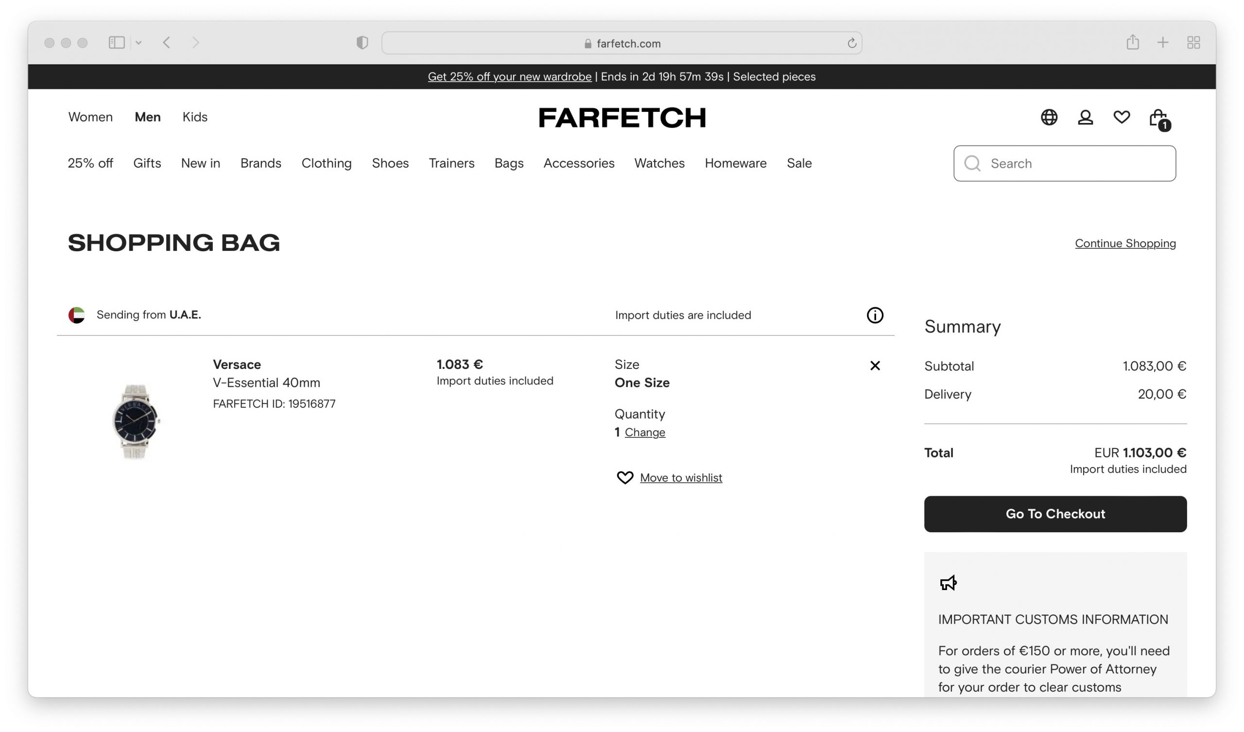
Of course, the checkout process should be secure before anything else, but it should also be seamless and easy.
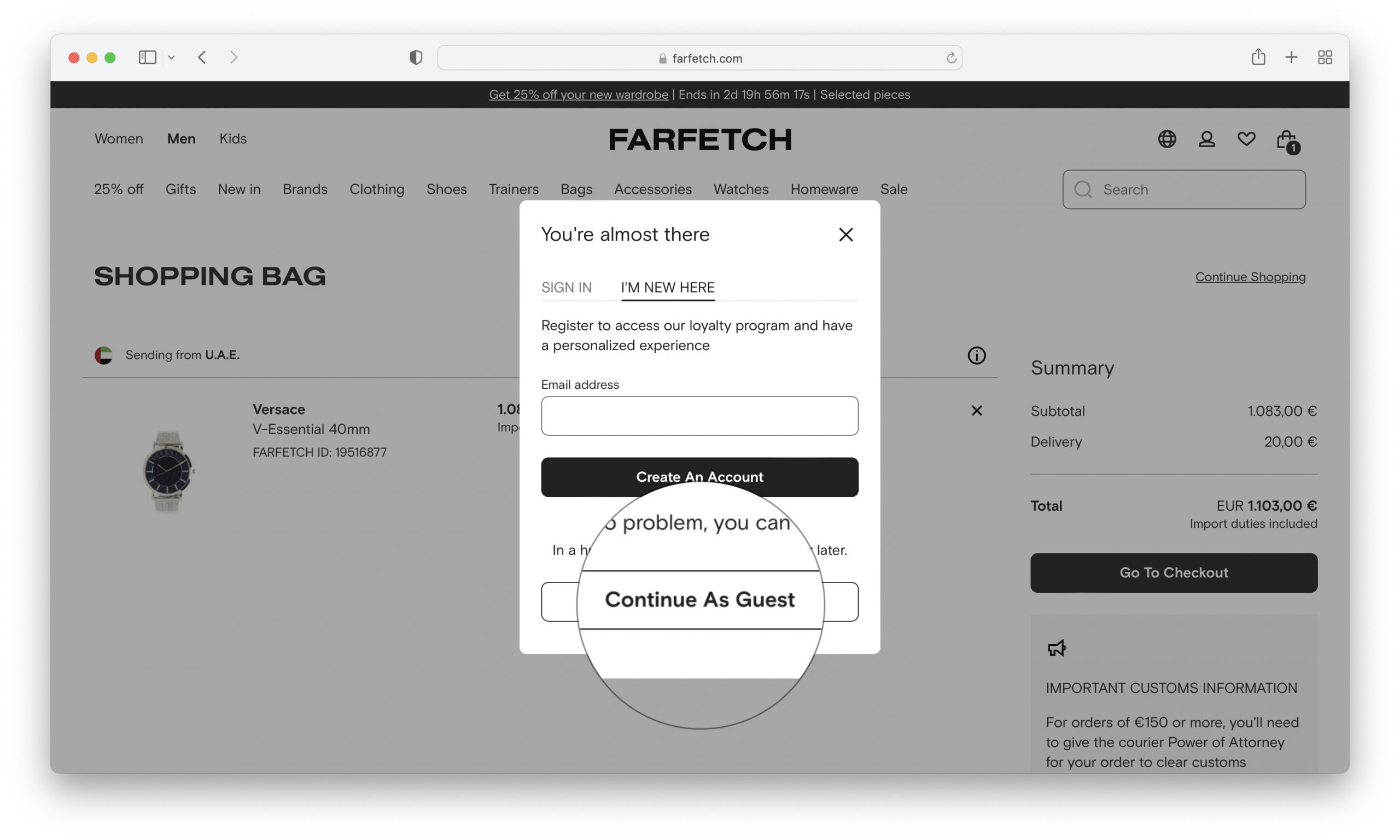
For example, if a website doesn’t require you to have a registered account, in other words, if you can purchase as a guest, this will be a big plus for your business.
4. Product Information and Listings
Product information and listings are the primary ways potential customers learn about and compare your products.
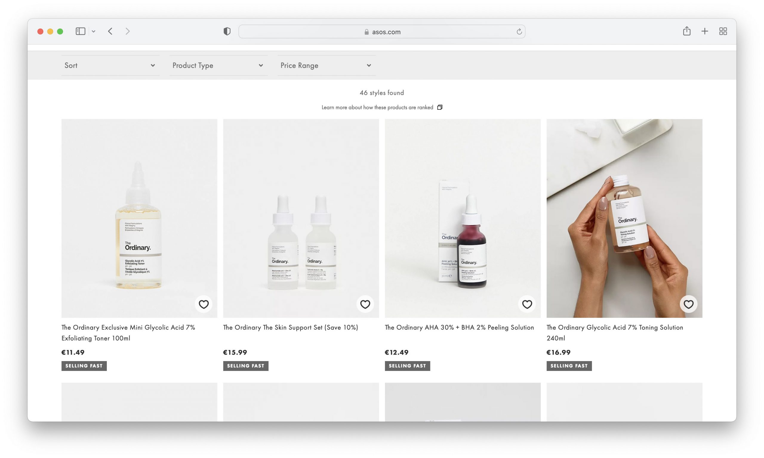
When customers can access accurate, comprehensive, and easy-to-understand product information, they are more likely to make informed purchase decisions.
Crafting Engaging Product Descriptions
Everything is about engaging content these days! If your product descriptions are engaging, it is more likely that the person will feel something about the product or maybe get a different idea.

What is the first thing that many potential customers will read about your products? Product descriptions. When customers are shopping online, they typically scan product listings to get a quick overview of what is available or to find what they are looking for. If your product descriptions are engaging and informative, you will be more likely to capture their attention and convince them to learn more about your product.
Showcasing High-Quality Product Images
Product images should be detailed and high-quality, as you may expect.
When you’re selling products online, it’s really important to use clear and detailed photos.
Think about how you shop online: you can’t touch or try the product, so the picture needs to do all the talking.
For example, suppose you’re selling clothes, like Asos. In that case, the photos should show the clothes from different angles and highlight their color, texture, and any special features like unique buttons or patterns.

Similarly, as seen in the example from NEXT, if it’s an item of furniture, the images should help the buyer understand the size, the material it’s made of, and how it might look in their space.
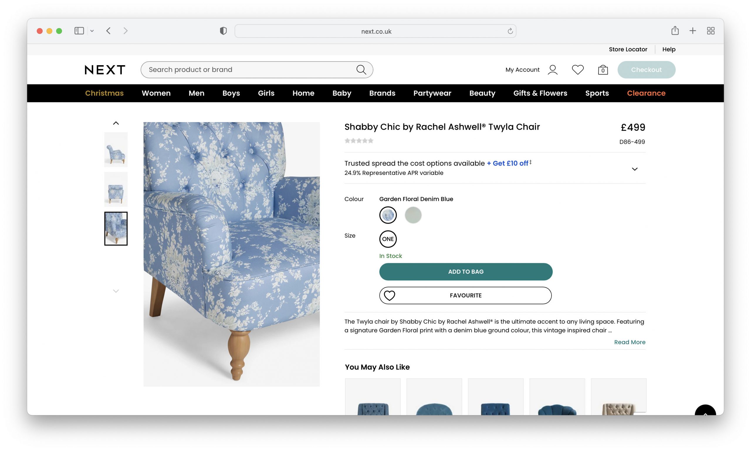
High-quality photos help customers feel more confident about what they’re buying.
5. SEO and Online Visibility
Where is the first place most people go when they want to find out about something? Search engines. Your e-commerce website can increase organic rankings on search engine result pages (SERPs) if you have effective SEO strategies and focus on online visibility.

Why is this important? Good SEO means when potential customers search for products or services related to your business, you have a higher chance of appearing at the top of the results list.
This increased visibility leads to more website traffic and, accordingly, a higher chance of reaching potential customers. Also, it is beneficial for brand credibility and trust.
Conducting Thorough Keyword Research
Keywords! Keyword research is the most crucial part of SEO. It’s how e-commerce websites find out what people are searching for online.
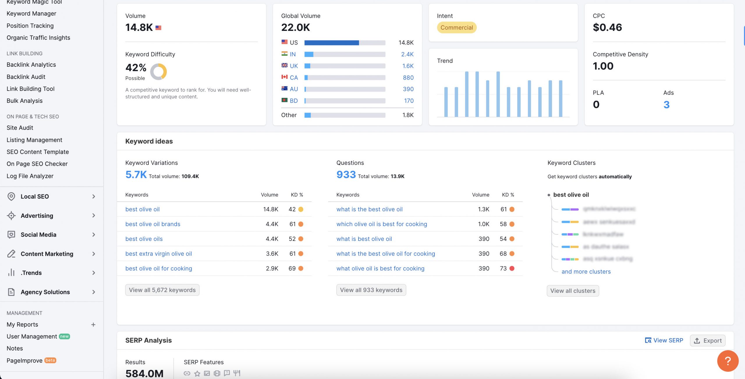
Once they know these keywords, businesses can create content that matches their target audience’s searches. This strategy helps them get more visitors to their website who are actually interested in what the business is offering.
Optimizing Product Pages for Search Engines
Don’t forget that you need to optimize your product pages for search engines too.
To optimize product pages for search engines, businesses can use various techniques, such as including relevant keywords in the title tags, meta descriptions, headings, and product descriptions.
These optimizations help search engines understand what the page is about and improve its visibility in search results.
Do you want to increase visibility, attract targeted traffic, and ultimately increase sales? Focus on SEO and online visibility.
6. Branding and Identity
Why should people buy from you? Why do you stand out? What is special about your products/services?
You answer these questions through branding and identity. By communicating a unique selling proposition (USP) and developing a strong brand identity, e-commerce websites can create a lasting impression on their target audience. Considering that Shopify, the leading e-commerce platform, hosts 17.75% of all global e-commerce stores, leveraging its tools for strong branding and identity can be a game-changer for e-commerce businesses.
Investing in branding not only helps attract new customers but also fosters customer retention. When people connect with a brand on an emotional level, they are more likely to become repeat buyers and even recommend your business.
Developing a Strong Brand Identity
A strong brand identity helps establish trust and credibility with customers. It sets your business apart from competitors and creates a sense of loyalty among your audience. By clearly communicating your USP, you can highlight what makes your products or services special and why customers should choose you over others.

Branding goes beyond just a logo or color scheme – it encompasses customers’ overall experience with your brand.
From the website design to the packaging, from social media management to blog posts, every touchpoint should reflect your brand’s personality and values.
Communicating Unique Selling Proposition (USP)
It’s not just about selling products; it’s about creating an unforgettable experience that resonates with your target audience.
Communicating your unique selling proposition (USP) is the process of clearly explaining what makes your product or service different from and better than the competition.
Your USP defines what makes your business unique and why customers should choose you over competitors.
Creating a USP through research and knowledge helps you focus your marketing strategy and influences other marketing decisions in communications, branding, written and verbal style, and other marketing decisions.
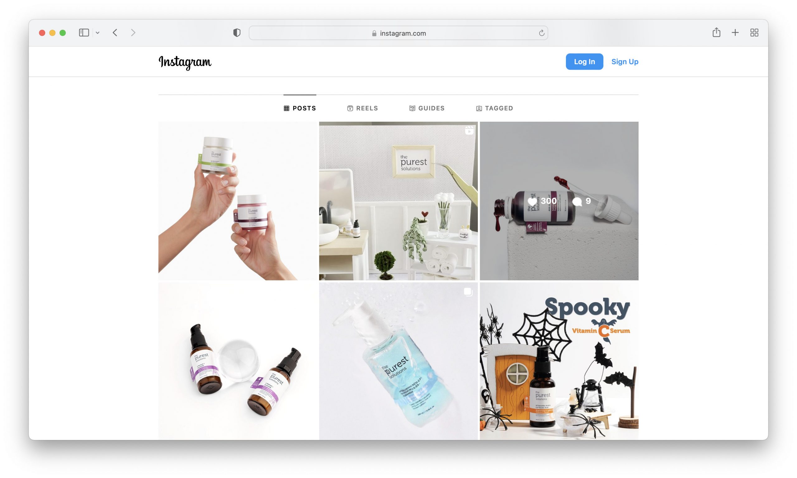
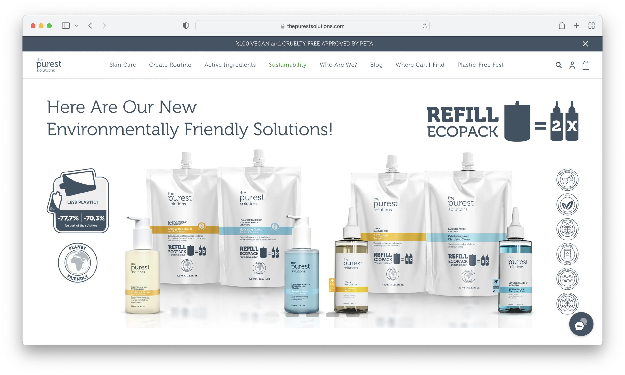
For example, The Purest Solutions communicates pureness very well in every aspect of their business.
In essence, a USP should quickly answer a potential customer’s most pressing question when they encounter your brand.
Identify your USP, be clear and concise in your USP, and communicate your USP consistently.
7. Conversion Optimization
So why should e-commerce websites focus on conversion optimization?
The answer is simple – it leads to increased sales and revenue.
By optimizing your website for conversions, you are maximizing the potential of every visitor that lands on your site. Don’t miss out on this opportunity to turn browsers into buyers.
Highlighting Value Proposition on Product Pages
One key aspect of conversion optimization is highlighting the value proposition on your product pages.
You should clearly show your products’ unique benefits and features to potential customers. Doing so creates a substantial reason for them to make a purchase.
Employing Effective Call-to-Actions (CTAs)
But that’s not all! Effective call-to-actions (CTAs) play a vital role in driving conversions.

A well-placed and persuasive CTA can guide visitors toward action, whether adding an item to their cart, taking a quiz, or completing the checkout process. With strategic placement and enticing language, CTAs can significantly increase your conversion rates.
Bonus: Juphy’s Role in Focusing on Important E-Commerce Website Elements
Crafting an outstanding e-commerce website involves careful consideration of key elements. While some aspects may initially seem straightforward, their implementation can be complicated or time-consuming. The optimization of your website is an ongoing but rewarding journey, impacting factors such as customer loyalty, trust, and conversion rate. Standing out in the crowded e-commerce landscape requires an innovative touch, and AI can offer transformative help. No need for coding skills for cutting-edge implementations – Juphy’s ‘Built for Shopify’ badged ChatGPT-powered AI Agent for Shopify is your solution, promising an increase in sales with a one-click setup.
See how it works:
Providing Immediate Responses
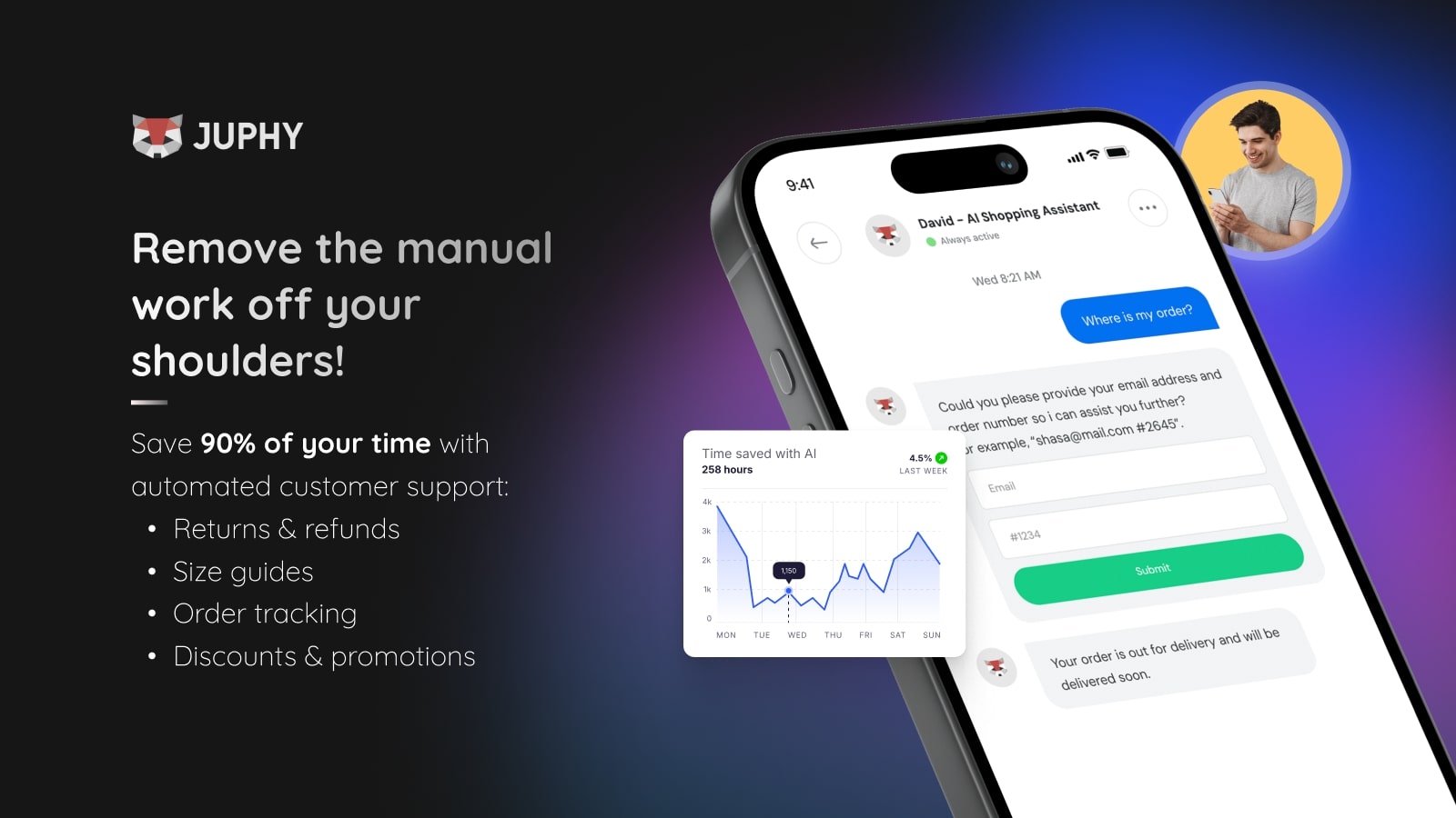
Having a reliable point of contact during the online shopping journey is essential for customer satisfaction and purchase decisions. Juphy AI serves as a 24/7 available virtual shopping assistant, responding to critical inquiries day or night, 365 days a year. It operates tirelessly, ensuring customers always have the support they need.
Conducting Sales and Support
Customer assistance should extend beyond the purchase, addressing post-purchase queries and building loyalty. Juphy’s AI Agent not only excels in raising sales but also in guiding customers through post-purchase processes, such as return and exchange policies, shipping status, and detailed product information. It helps you save valuable time and even sells while you sleep.
Automatically Updating Itself
Keeping your online store updated is important for trust and a consistent brand image. Juphy’s AI Agent for Shopify automatically adapts to changes, delivering real-time information about your store and products. It ensures a synchronized growth of your store and chatbot, eliminating the hassle of managing separate updates while reinforcing a strong brand identity.

Conclusion
As we mentioned multiple times, e-commerce has become highly competitive, so is it still advantageous? Yes, it is.
Thanks to its many advantages that are still valid, setting up an e-commerce site is still among the most popular business ideas.
It is still possible to be successful with good planning, offering quality products and services, and focusing on some key elements we have shared today while creating your website.
Key Takeaways
- Trust is Crucial: Establishing trust with security measures and transparent communication is essential.
- Importance of Visual Appeal: An aesthetically pleasing design is key to attracting and retaining customers.
- Navigational Ease: User-friendly and intuitive navigation enhances the shopping experience.
- Comprehensive Product Information: Detailed and engaging product descriptions and high-quality images are vital.
- SEO and Visibility: Effective SEO strategies increase online visibility and drive traffic.
- Branding and Identity: A strong brand identity and clear USP are crucial for differentiating from competitors.
- Conversion Optimization: Focusing on conversion optimization, including clear CTAs, improves sales and revenue.


