E-Commerce Website Design: Best Practices, Tips & Tricks
Inci Vardar
Before moving to my current home, I used to shop from a greengrocer with higher prices than the rest. There were other places where I could shop, some even closer to my house, but none of them lined up fruits and vegetables as well as he did. The best-selling goods of the season were placed outside, radiating freshness and grabbing the attention of every passing person with their vivid colors, while greens looked greener and healthier with the bright lights inside. After all, he was selling apples and onions, but the harmony of colors and the general feeling of freshness made me willingly pay more. A good e-commerce website design has a similar effect on prospects and customers. An e-commerce website should also inspire confidence in people about the quality of products, allow the customers to shop effortlessly, and encourage them to discover more. With a well-thought-out e-commerce website design, you can unlock your real sales potential.

The Power of First Impressions in E-Commerce
People don’t get a second chance in life to make a first impression, and most of the time, it is the only chance to convert a visitor to a customer in e-commerce. According to a study, 75% of people base the credibility of a business on how their website looks, and it takes about 50 milliseconds for visitors to form an opinion on your website. In the highly competitive e-commerce arena, a few seconds is all it takes for a customer to decide if he or she will be “your customer” or try the next link in search engine results pages.
The website stands as a virtual storefront. When potential customers see it for the first time, they form an immediate impression based on the e-commerce website’s design, user-friendliness, and overall presentation.
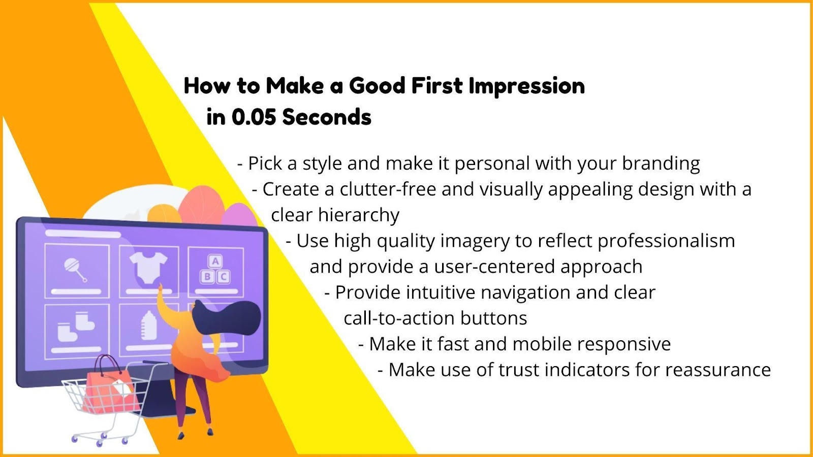
At this stage, before reading all the beautiful and useful stuff you’ve written to make your products more desirable, the users decide if you can provide them with a safe and effortless shopping experience. That’s why trust signals play a pivotal role in e-commerce website design.
Why Trust is Paramount in E-commerce Design
Online shopping is practically built on trust. Customers can’t physically touch products, have a face-to-face talk with sales representatives, or see if it is working or not, so their decisions rely on trust signals conveyed through the website’s design and functionality. Apart from the concerns about product quality and delivery issues, users must feel safe about providing their personal data and making financial transactions.
The design must instill confidence at first glance by:
- Showing the security measures that were taken clearly: Implementing SSL (secure socket layer) and displaying badges of security and industry compliance can reassure shoppers about the security of their data.
- Providing quick access to store policies: Displaying shipping and return policies on the product pages creates a sense that everything should go according to plan and could otherwise be easily fixed. You should also provide easy access to the privacy policy, informing the shoppers how your store operates and covering the web policies on sensitive user information.
- Being easily accessible: Whether with a website chat widget or links to social accounts, provide a variety of contact points so customers can reach out to you to get assistance in real-time.
- Using high-quality images and reflecting professionalism: Whether on the homepage or any other landing page, use high-resolution images. High-quality product images and other multimedia elements showcase products from different angles and in real-life scenarios, and they enhance the overall visual experience.
- Sharing ratings and reviews: If available, feature user reviews and ratings for social proof as they alleviate the shopper’s concerns and help them better understand the product.
Key Elements of a User-Centric E-commerce Website Design
The first impression means a lot, but there’s much more to do until you turn a prospect into a customer. The things they want to find should go hand in hand with the things you want to show them in a way that they can effortlessly navigate across. In order to create a seamless and enjoyable shopping experience, put yourself into your customer’s shoes and create a platform that gives them relevant information in the easiest way.
User Experience (UX) as a Pillar of E-commerce Design
User experience (UX) is a broad term that covers all the elements of an e-commerce website that enhance user satisfaction through accessible, user-friendly, and streamlined interactions. When shoppers easily move around the website, find what they are looking for, stumble upon other interesting stuff, complete the transaction safely, and get quick assistance if needed, they don’t tend to abandon their shopping carts, and sometimes they become willing to pay more just for the sake of a seamless experience.

Crafting an Organic and Consistent Design Flow
A design flow for an e-commerce website is the sum of all actions taken by the user to accomplish a goal. It starts from the moment visitors land on the website until they complete their desired actions, such as making a purchase. It can start from different points, such as a specific product page or the homepage, and it should take the customer from A to Z most efficiently.
To create an organic and consistent design flow for your e-commerce website, the best practices can be summarized as:
- Define a series of goals for your website: The ultimate goal is to encourage your customers to complete a purchase, but there can be other steps on the way. For example, you can welcome your customers who land on the homepage with the new arrivals or make an exclusive offer to those who sign up for the newsletter. These goals should reflect your main value proposition as well as address your target audience’s needs and expectations.
- Create a site map or a flow chart: A flow diagram outlines the hierarchy of pages on your website and provides a more user-centered view of the overall structure. It helps you see the big picture, arrange the steps in an optimized way, and simplify the process for the customer by shortening the path to sales. Additionally, it can serve as a valuable step to get advice from experts in website design and development, ensuring your site is both user-friendly and effective in achieving your goals.
- Pay special attention to easy access and consistent navigation: The navigation system around the website needs to be clear, convenient, and consistent. Use familiar placement for navigation elements, such as the menu, search bar, and shopping cart, to ensure customers can easily find their way around. Make their life easier by adding elements like filters, quick photo previews, and search autocomplete so they won’t have to click through seven different menus and pages until they find the exact product they are looking for. A clearly defined website architecture and corresponding navigation also support the SEO performance of your e-commerce website.
- Don’t go overboard with pop-ups: You can provide important information, such as a discount code or live chat support, as static UI elements instead of a self-activated pop-up.
- The visual hierarchy should support the goals: Either on the home page or product pages, organize the content with a clear visual hierarchy. Our brain processes visual information faster than written content, thus highlighting important elements, such as product images, prices, and call-to-action buttons guide the shopper’s attention and actions.
- Design a streamlined and secure check-out process: Littledata surveyed 2,115 stores in 2022 and found the average checkout completion rate for e-commerce websites was 46.1%. It either means that the economy is shrinking or the check-out process is too long and painful. Giving your customers the option to register for your site or to check out as a guest can deprive you of some valuable segmentation data at first. However, delaying account creation or loyalty program subscription to a separate step, such as the next page or a confirmation email, can increase the chances of completing a purchase.
- Make it accessible for all: Design with accessibility in mind to ensure that all users, including those with disabilities, can access and navigate your e-commerce website easily.
- Optimize for future purchase potential: Allow users to save items in a wishlist or a “save for later” section to encourage them to return and complete their purchases.
Mobile Optimization: A Non-Negotiable in E-commerce Design
Today, mobile devices are the dominant form of online communication and commerce. This makes mobile optimization a crucial part of designing for e-commerce. Although the conversion rate of online shoppers remains higher for desktop than mobile, Google started using mobile-first indexing to rank content in search results for users searching on smartphones or tablets because it makes up quite a large portion of internet shoppers.
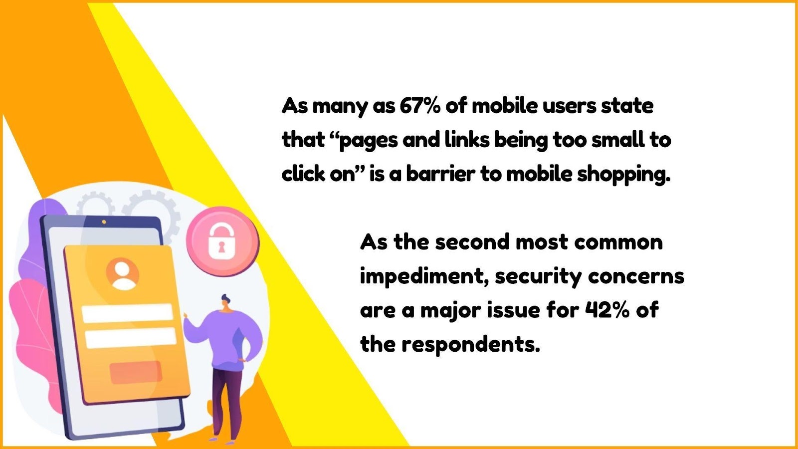
Compatibility across all devices is also important for social commerce opportunities. According to data, out of 4.48 billion social media users, 99% access websites or apps through a mobile device, with only 1.32% accessing platforms exclusively via desktop. This means if potential customers reach out to you on social media platforms for sales assistance, you wouldn’t want to direct them to an online store with poor mobile performance. Mobile optimization of your e-commerce website design can provide a more satisfactory experience to your customers and also nurture your brand image with social proof.
Social Proof: The Power of Customer Reviews
It is hard to make an educated decision based only on product photos and basic information, so we consult others who have been in our shoes to learn more about a product’s quality or a retailer’s reliability. This is where ratings, reviews, testimonials, recommendations, and customer comments on social platforms come into play, and they play a significant role in a brand’s sales.
How User-Generated Content Boosts Your E-commerce Website
A brand’s marketing team does its best to make the products appear more desirable to the masses, providing all the necessary information in beautiful sentences and alluring visuals. But the masses know that the marketing team is biased. This is why shoppers turn to user-generated content (UGC) to make smarter choices. Basically, user-generated content is free marketing.
User-generated content boosts your e-commerce website’s sales potential because:
- It is authentic: When shoppers see that real customers have used and enjoyed a product, they are more likely to trust the brand and make a purchase.
- It benefits SEO: User-generated content often includes relevant keywords and phrases that customers use when describing products. This supports SEO, potentially leading to higher organic traffic and visibility.
- It can reduce return rates: Detailed product reviews that are supported by authentic visual content can provide a better understanding of products to potential buyers and set expectations.
- It can amplify your message: When users share their experiences with a product on social media, it can reach a broader audience and potentially attract new customers who may not have come across the brand otherwise.
- Engagement can lead to repeat business: Customers who are actively engaged with a brand by leaving reviews, comments, or sharing their experiences are more likely to become repeat buyers; thus, UGC should be encouraged.
As the positive experiences shared by others significantly affect conversion rates, UGC can also be a powerful element of your e-commerce website design.

Displaying Product Reviews and Ratings Effectively
Reviews are valuable assets that need to be displayed in relevant, prominent spaces of an e-commerce website. You can place them on the homepage, product pages, and sometimes on SERPs (search engine results pages) as rich snippets.
Ideally, star ratings and review summaries are placed near the top and above the fold so visitors can easily see them without scrolling. Detailed reviews are usually placed at the bottom with filter options based on different criteria, such as most recent, highest-rated, lowest-rated, etc.
Allowing visual content attachments, such as photos and videos, enhance insights about product usage and features. Remember that these reviews must be subject to moderation for quality control. But it doesn’t mean that you should hide or delete “less than perfect” reviews. According to a 2021 study, purchase probability peaks when a product’s average star rating is between 4.2 – 4.5 because consumers perceive a perfect 5-star rating as too good to be true.
Responding to the reviews is as important as publishing them because it can turn negative reviews into positive ones and encourage further customer engagement. It shows that the company values customer feedback and is willing to address problems. Transparent and informative reviews contribute significantly to improving sales performance and customer satisfaction.
Building Trust Through Transparency: Trust Signals in E-commerce Design
Apart from the transparency on user ratings and reviews, the quality of visual content and ease of access build trust through transparency.
High-Quality Images as a Trust Signal
As mentioned, an online shopper relies on limited information before making the final purchase decision. High-quality images showing the products from different angles and in greater detail help bridge the gap between the online shopping experience and seeing products in person. As well as setting expectations, visually appealing product images convey professionalism and authenticity. Reflecting a commitment to quality, high-quality images play a significant role in gaining trust.
Providing Clear and Accessible Contact Information
Ensuring the e-commerce website has easy-to-find contact information like the address, phone number, and customer support email makes visitors feel more confident that there’s a real business behind it. Providing links to social media profiles also makes a brand more approachable. As mentioned before, website chat widgets can also grant quick access to representatives. This means customers can contact the company if they have any questions or issues across multiple platforms.
Building trust among your customers improves your sales success and overall brand image and increases the possibility of gaining loyal customers. Many of the trust signals mentioned in this article are related to customer interactions. These interactions must be meticulously managed through all available platforms, preferably in real-time. The better your brand handles and nurtures engagement, the stronger the customer loyalty and advocacy will become.
Best E-commerce Website Design Examples from Shopify
Juphy: Your Partner in E-commerce
Juphy’s AI Agent, featuring the ‘Built for Shopify’ badge, is designed to amplify your store’s sales potential and enrich the shopping experience for your customers, operating tirelessly around the clock. It’s not just about handling transactions; Juphy transforms the way you connect with your audience, making every interaction a step towards building lasting relationships and boosting sales.
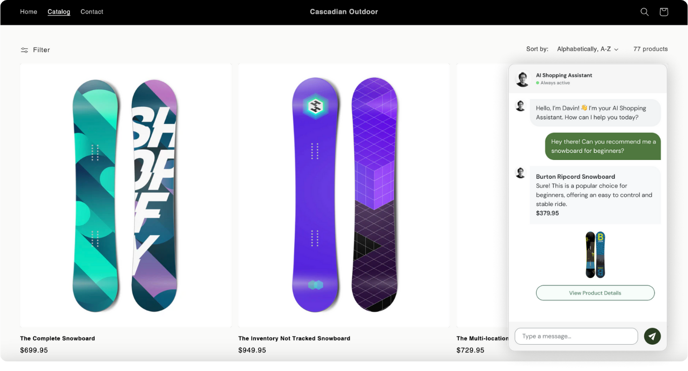
Here’s how Juphy’s AI Agent can transform your Shopify store:
Tailored Shopping Journeys: Leveraging advanced algorithms, Juphy identifies potential customers across various social platforms, offering personalized product recommendations that lead them directly to your store.
Drive Traffic, Boost Sales: Beyond just engagement, Juphy excels in sharing the right product links with interested buyers, driving meaningful traffic to your site, and meticulously tracking user actions to refine future marketing strategies.
Always-On Customer Support: With Juphy, your store is never closed. It provides round-the-clock customer support, ensuring that every query is answered, and every shopper’s concern is addressed, paving the way for a seamless shopping experience.
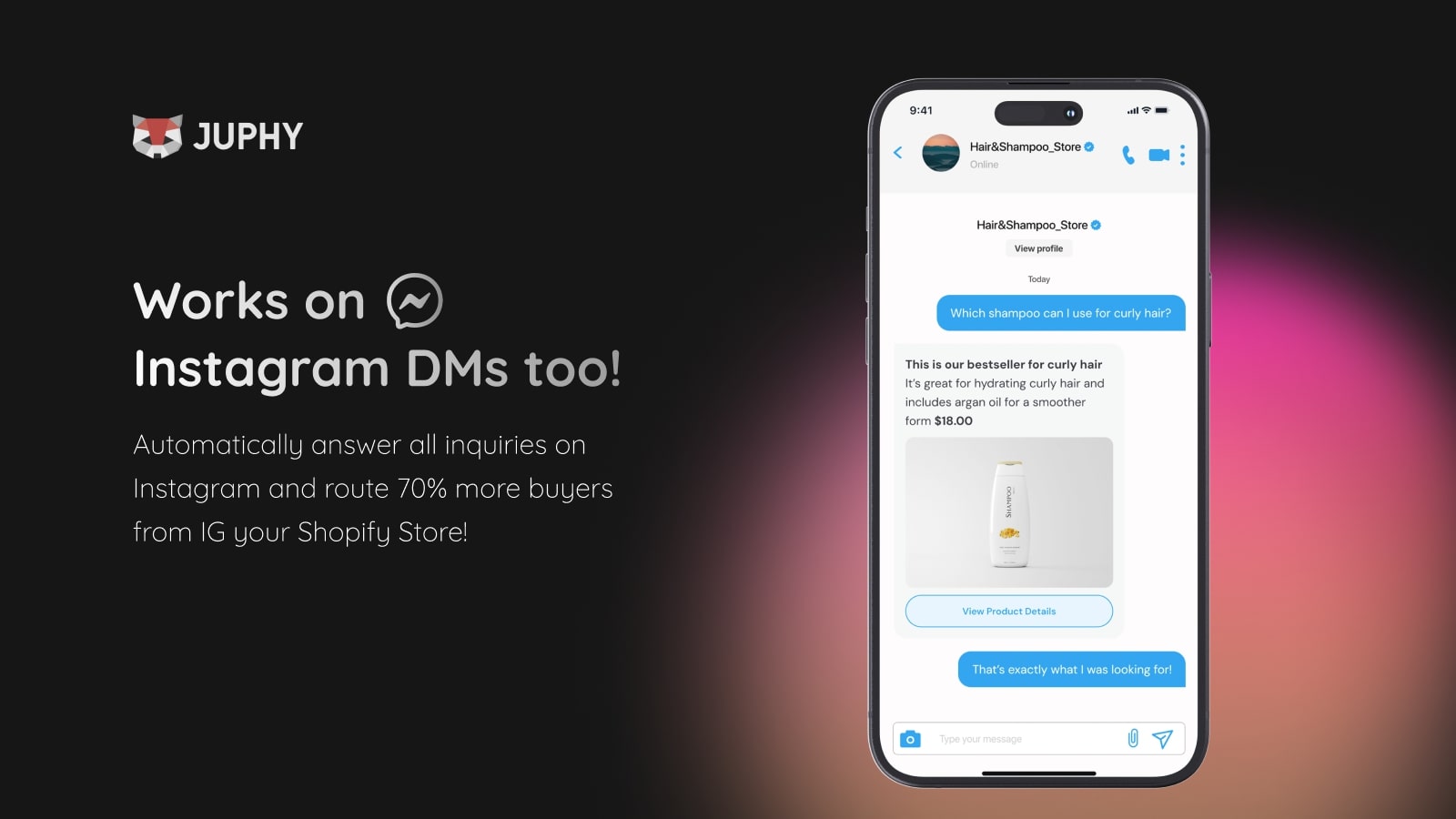
Smart Data Utilization: Information is power, and Juphy harnesses it to the fullest. It collects and utilizes customer data to facilitate successful upselling and crafting experiences that resonate on a personal level.
Seamless Integration: Juphy’s intuitive chat widget integrates seamlessly with your Shopify store, enabling real-time, personalized conversations. This not only enhances customer engagement but also significantly boosts conversion rates.
Insightful CRM Features: Dive deeper into your customer base with Juphy’s CRM. It offers valuable insights into customer behavior, preferences, and feedback, empowering you to tailor your marketing and product offerings more effectively.
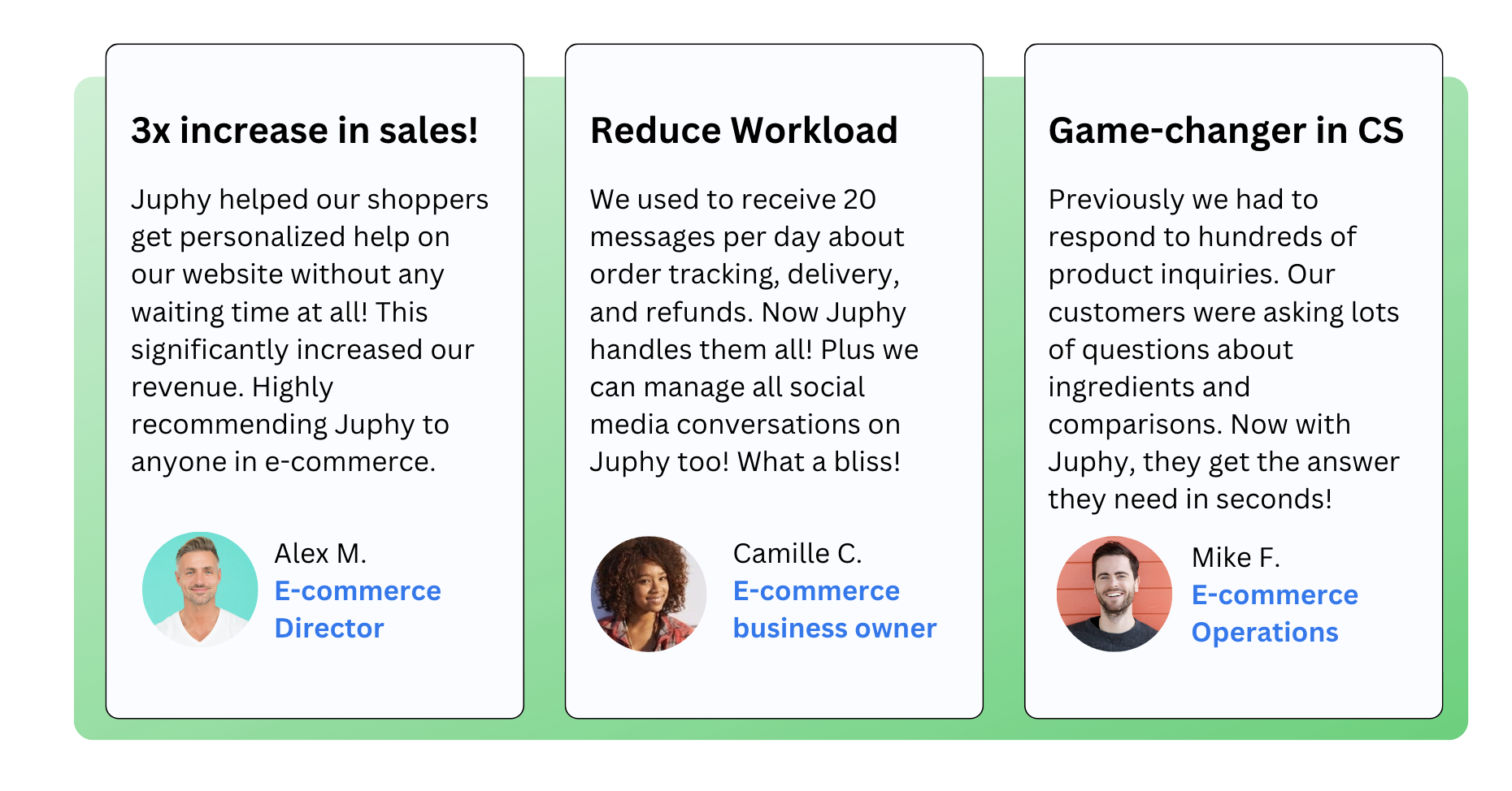
Juphy’s AI Agent is more than just a tool; it’s a comprehensive solution designed to navigate the complexities of e-commerce, ensuring your Shopify store not only meets but exceeds your sales goals. Ready to revolutionize your e-commerce journey? Start your free trial today!
Conclusion
In e-commerce website design, inspiring trust in visitors directly affects sales. When working on your website’s design process, remember that a trustworthy e-commerce platform employs secure payment gateways, transparent policies, relevant information, and well-designed product pages with high-quality imagery. Utilizing trust signals such as user-generated content can contribute to credibility. When users trust an e-commerce website, they are more likely to complete transactions, return for future purchases, and recommend the brand to others, fostering long-term success for your e-commerce business.

