Kith Review: Personal Storytelling and Effortless Styling
Glory-Anna Oshafi
Kith is a high fashion brand specializing in men’s, women’s, and kids’ clothes, footwear, and accessories. Shopping starts the moment you visit the Kiths store. The homepage lists several outfits that absorb visitors when they land on the website. The clean layout and color of the website help the product images stand out. Plus, when you hover over an item, a photo with a model wearing it appears, assisting visitors to envision how the product will look on them. We have so much to discuss about the Kith website. Stick around for the complete Kith review.

Comprehensive Feature Analysis
We’ll break down the website into different aspects for a thorough analysis, starting with the product descriptions.
Product Descriptions and Collections 6/10
You can shop for a complete outfit from Kith. They have clothes, footwear, and accessories. See how we rate the product descriptions and collections using the following metrics:
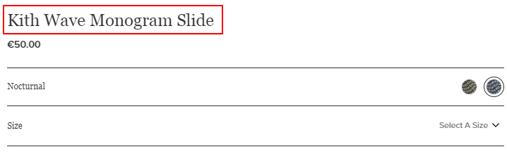
- Clarity and Descriptiveness
The Kith product descriptions highlight the product’s features. You’ll find what the material is made of, the design, color, the size available, and a sizing guide. Here’s what it looks like:
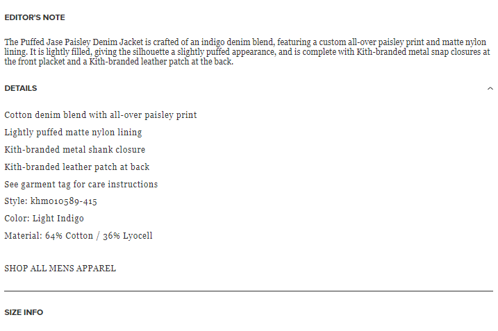
Generally, the descriptions communicate the products’ features effectively. But it’s not convincing enough. A persuasive product description describes the product materials and their benefits. For example, instead of saying, “The v-neck jumper is made with 64% cotton and 36% lyocell,” you can say,
“The v-neck jumper is crafted from a blend of 64% cotton and 36% lyocell, combining the softness and breathability of cotton with the smooth, eco-friendly qualities of lyocell. This blend feels incredibly comfortable against the skin and offers durability and a luxurious drape that keeps you looking effortlessly stylish all day long.”
This description explains the benefits of the material choice, which can convince visitors to buy. Another way to optimize the product description is by adding aftercare tips. This will help buyers take better care of the product for extended use post-purchase.
The Kith product descriptions lack emotion. People buy with emotions. This is another area to improve on.
- SEO vs. Readability
We did a Google search for “V-neck jumper women,” and Kith was not on the first page of search engine results. But when we made the keyword a little more specific by adding “gradient,” the JW Anderson V-Neck Gradient Jumper listed on Kith appeared in the product results.
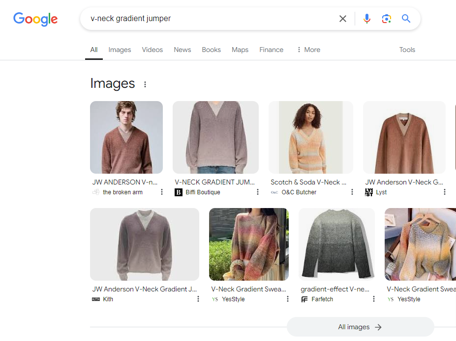
Judging by this and some other experiments we did, it’s obvious that Kith needs to work on SEO to beat the competition. Making the product descriptions more descriptive will provide an avenue to introduce relevant keywords.
As for readability, the descriptions are easy to read. We can’t say they are enjoyable, though.
- Creativity and Branding
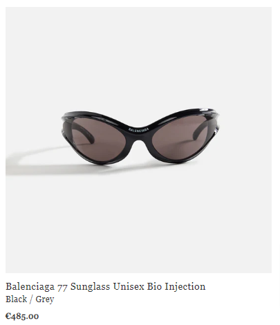
Kith is famous for its collaborations with notable brands like Adidas, Converse, and Balenciaga. Each product name specifies the brand that owns the design and its unique name. This helps customers differentiate products. See the images below for an original Kith design and a Balenciaga sunglass.
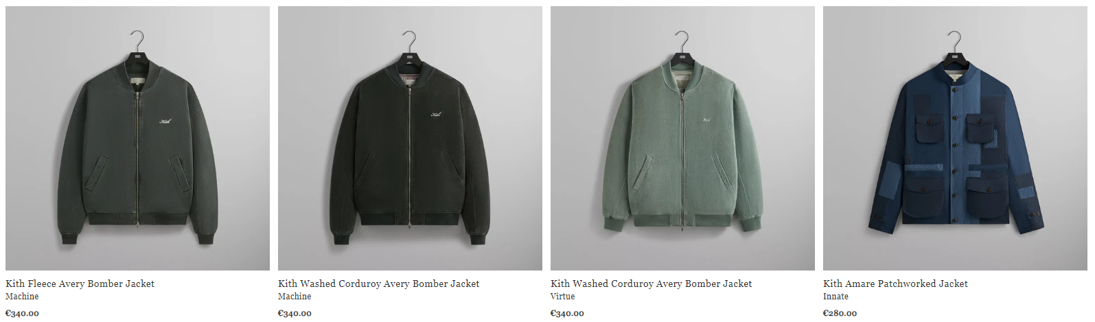
The product names for Kith’s designs are descriptive. It starts with the brand (or collection) name, followed by a concise product description. Check the following image for an example.
Although not creative, the product names convey essential information to the customer.
- Organization of Collections
Kith offers many products, from original designs to brand collaborations. Then, they have items for different genders and kids. Plus, the brand is always releasing new designs. See how their variety of products are organized.
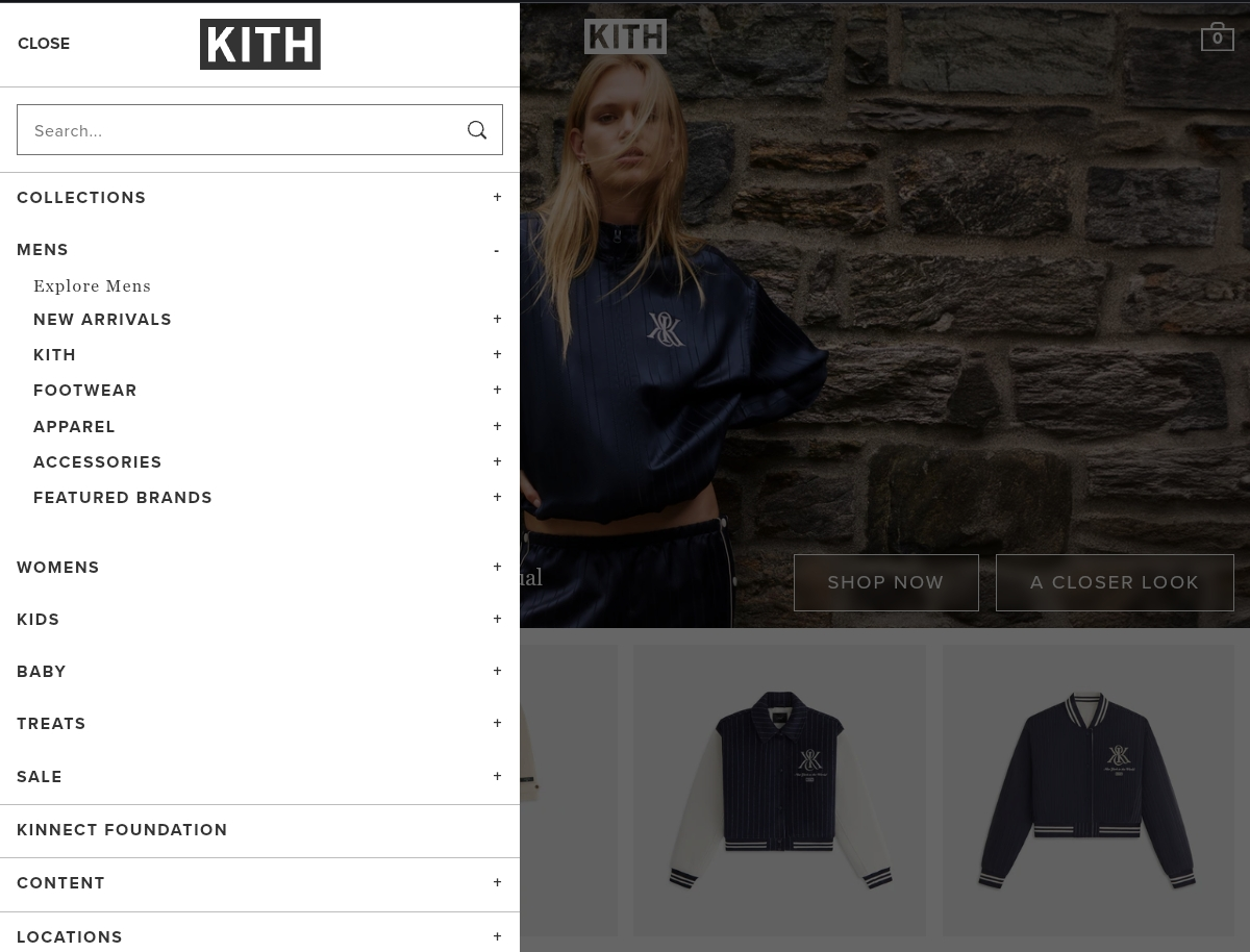
Considering their wide range of products, the organization is commendable because it simplifies navigation. Additionally, the option to explore everything within a category helps customers quickly access the full selection of products relevant to their interests. See the image below.
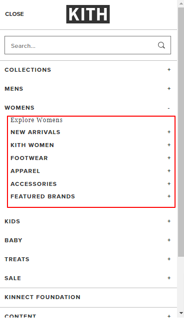
For example, women looking for the entire Kith’s women collection can click “Explore Womens” to see everything and get what catches their eye.
- Customization & Visuals
The product page doesn’t include information on how customers can customize Kith’s products. However, it recommends complementary items.
Furthermore, the product images stand out due to their neutral background, which highlights the product and makes the colors pop. Also, the photos of models wearing the item help customers assess the fit. They also include close-up shots to show details.
One improvement could be making the additional images more noticeable. The arrows indicating more pictures might not be immediately visible.
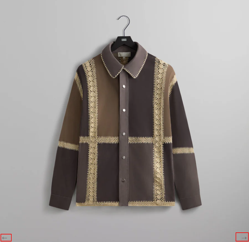
To fix this, Kith could animate the images to change when visitors hover over the main image. Another idea is to make a photo gallery that previews the other images underneath the main one. Then customers can click on any to expand it.
User Experience 7/10
Kith’s website features a clean layout. The simplicity and color help users focus on the products and their details. The website has a hamburger menu that’s visible against the homepage’s background.
Also, navigation is intuitive and user-friendly. The products are effectively categorized to improve the shopping experience, and the website adapts seamlessly to different screen sizes. All of these enhance the user experience.
But we noticed some areas for improvement. First is the checkout page. Customers have to fill in an overwhelming number of fields, especially on smaller screens. This can put customers off completing the purchase.
Kith can address that by hiding some sections or collapsing some fields into a single one. For example, instead of “first name” and “surname,” we could have just “full name.”
Also, they need to reduce the pop-ups that appear when navigating the site. They could detract from the overall user experience.
Customer Service and FAQ Page 6/10
The Kith website has a chat widget that helps customers find information within the website. For example, we asked the bot if the company ships to Italy, and it recommended an article for help.
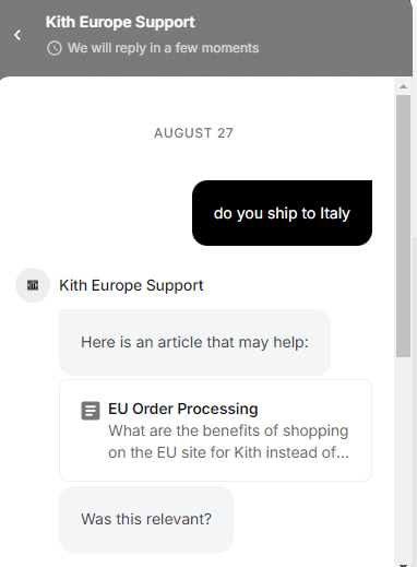
But when we clicked the article, we had to scroll through irrelevant Q&A to find the answer to our question. The chatbot recommended the entire article on Shipping FAQs. Without using the bot, customers can navigate to the FAQ page from the website’s footer.
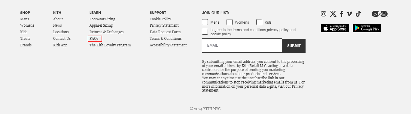
The FAQ page features a grid view of questions covering various aspects of the brand, with the option to switch to a list view. It also has a hamburger menu that provides access to a side navbar with all FAQ topics to facilitate easy browsing.
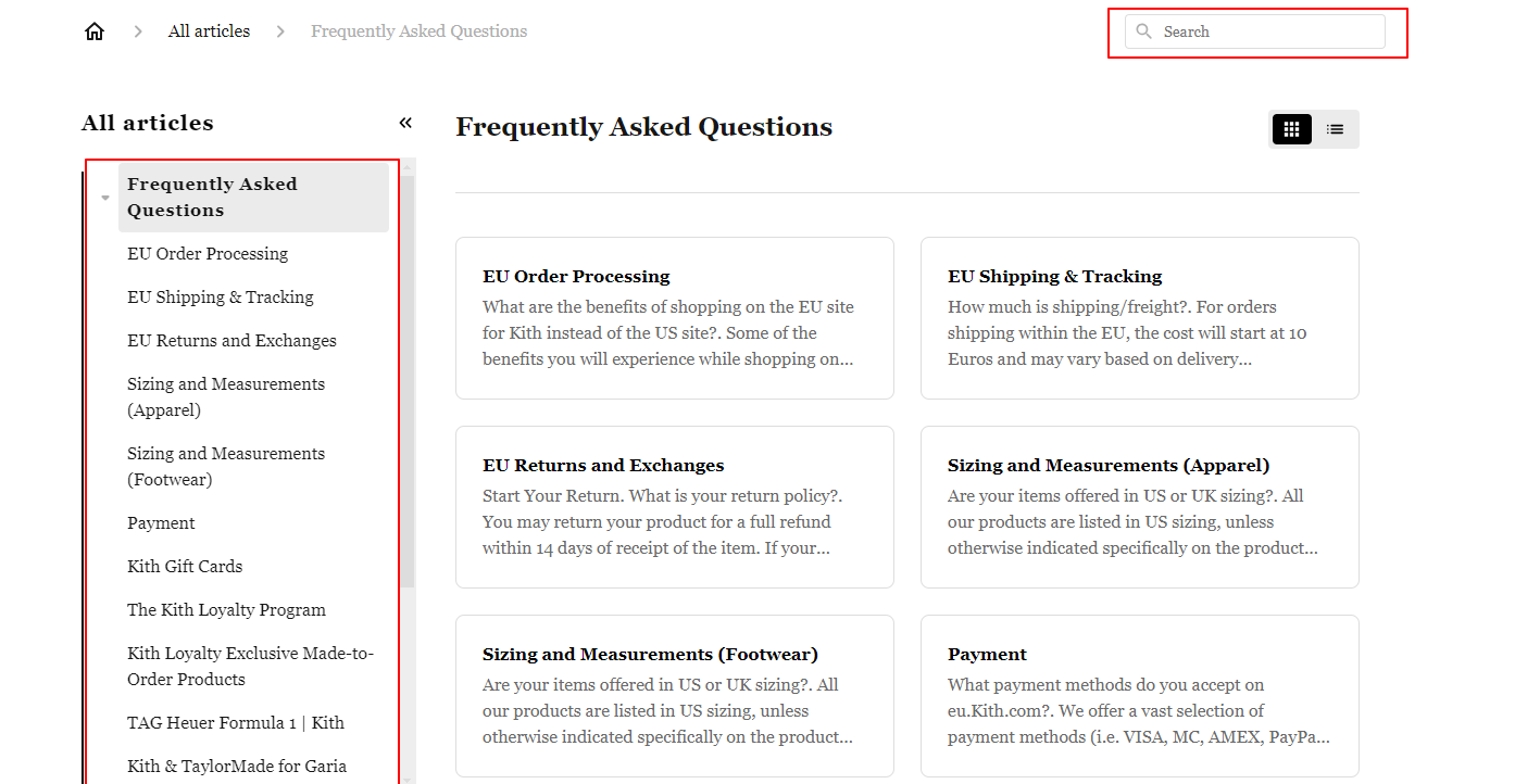
Additionally, the page includes a search function that allows users to input relevant keywords to find information. However, the search functionality can be inconsistent. For example, a search for “Do you ship to Italy?” yielded no result.
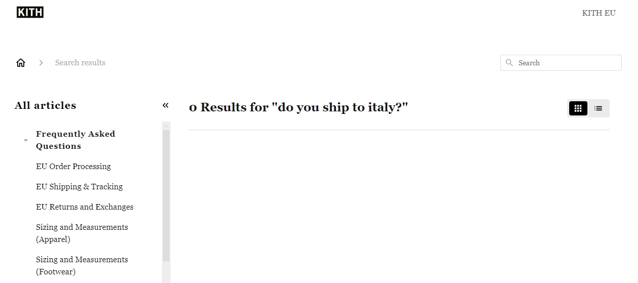
But when we searched “Shipping,” it came up with multiple results.
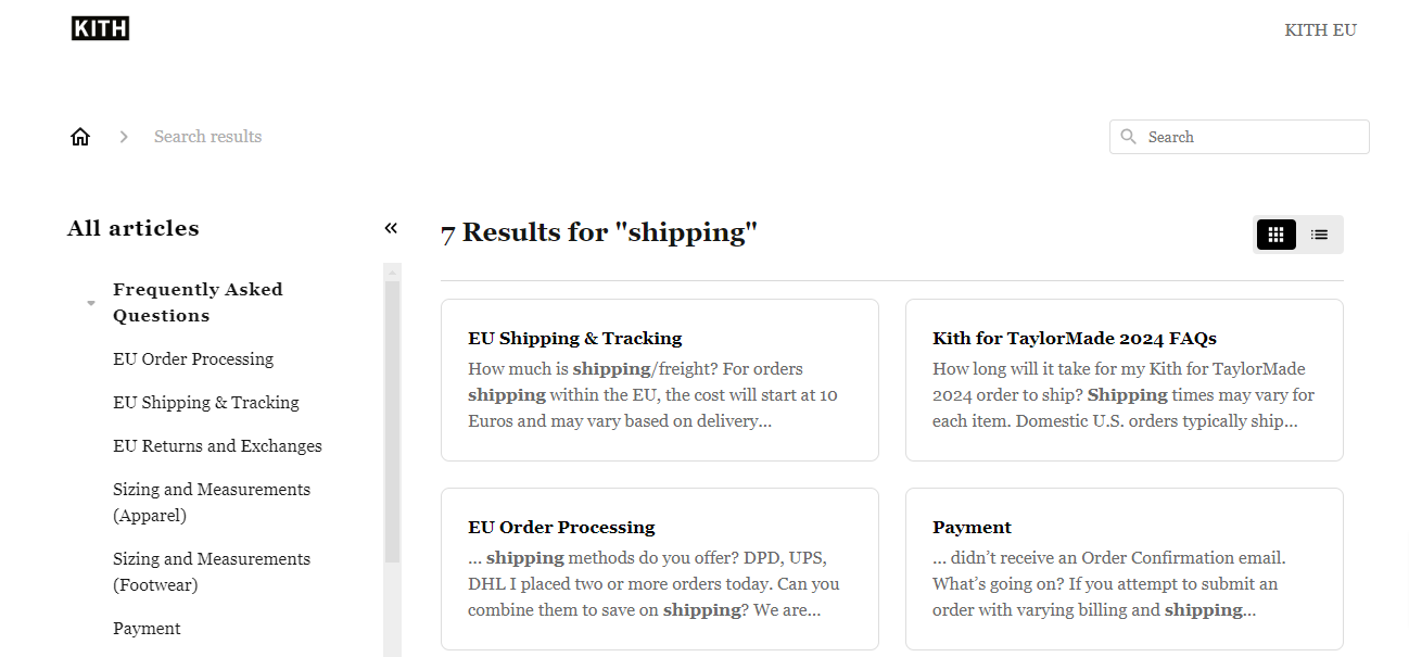
This might make finding information difficult for users who enter specific queries. We recommend upgrading to an intelligent chatbot to fix this issue. We will discuss this later.
Return and Shipping Policies 8/10
The shipping and return policies are on every product page.
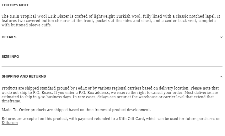
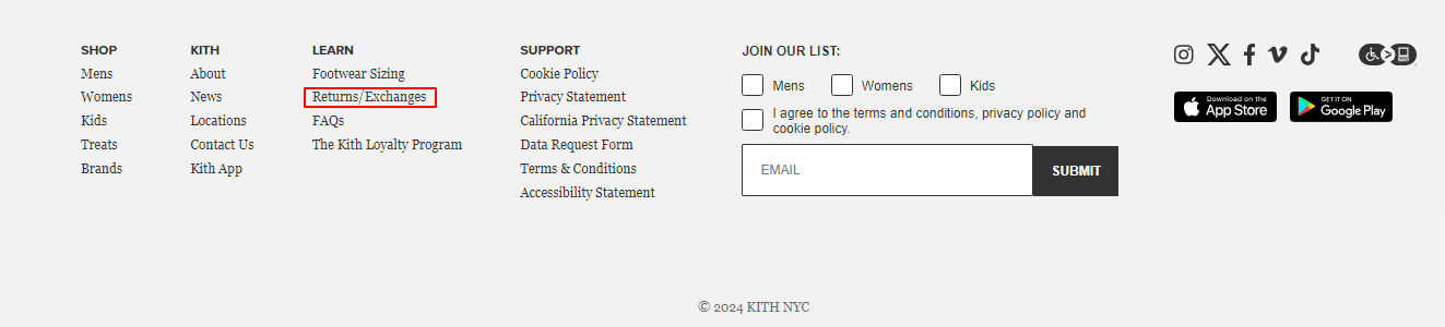
Having these policies on the product page ensures customers learn all the relevant details before checkout. Customers can access the more comprehensive return policy from the website’s footer.
While the brief information on each product page provides relevant details about the return policy for that specific item, adding a hyperlink to the returns page would be beneficial.
This would allow customers to quickly access comprehensive return information directly from the product page rather than scrolling down to the footer to find the returns/exchange menu item.
Promotions and Discounts 8/10
Kith doesn’t have promotional copies plastered all over their website. Items on sale are organized in one category. Some products in this category are listed for less than half the original cost. See the image below.
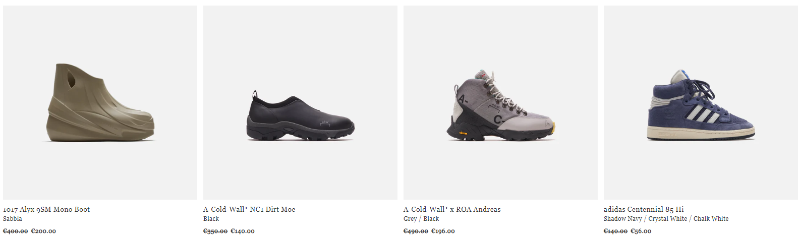
Although the brand doesn’t actively advertise its promotions, the discounts are significant and offer customers the opportunity to purchase quality items at a reduced price.
Special Features and Innovations 7/10
When you shop in Kith Europe, you can select the European currency you want to see across the website.
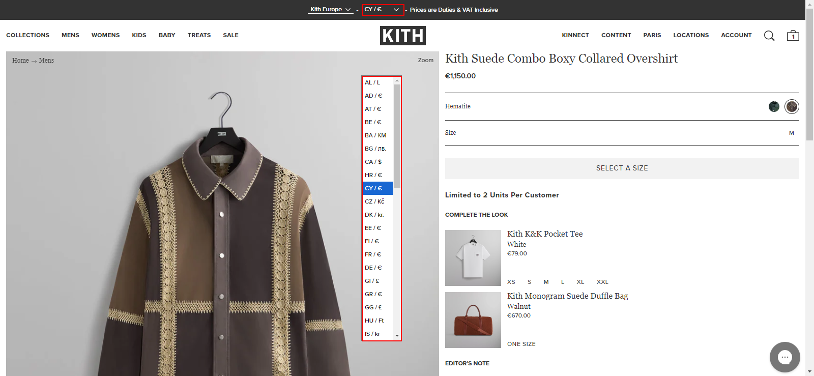
When you click the downward arrow next to the country code/currency you’re already browsing with, a list will appear with more country codes/currencies. This facilitates international shopping as customers can shop in a convenient currency.
Kith also offers a loyalty program that rewards loyal customers using the Kith app. Customers are placed in different tiers based on how many points they’ve accrued. They use these points to access special offers and exclusive perks.
Strengths Showcase
Some of the strengths of the Kith brand include:
- Clean Website Layout
Kith’s clean website layout helps their designs shine. Furthermore, the simple design makes the site intuitive, enhancing the user experience. The uncluttered approach reflects modern web designs, which align with the brand and its target audience.
- Brand Collaborations
Collaboration with popular brands is another reason Kith is popular. They put all the brand collaborations in one category and have an alphabetical arrangement of all the brands they’ve worked with to help customers find them easily.
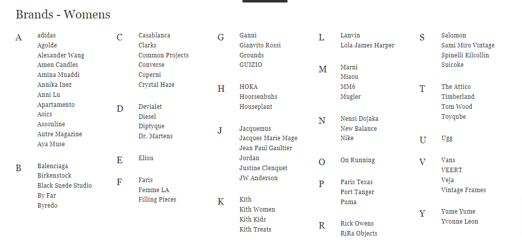
These collaborations expand Kith’s product range and expose them to a broader audience.
Growth Opportunities for Kith
After scouring the Kith’s website, we discovered the following areas for improvement:
- Product Descriptions
They must work on creating more persuasive product descriptions. The descriptions should make customers visualize themselves in the item and drive purchase.
- Blog Design
The blog is an innovative addition to Kith’s website, requiring optimization to engage visitors fully. Currently, the font size is tiny and illegible. So, increasing it will improve readability.
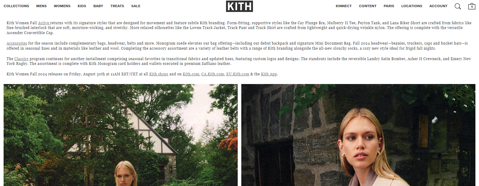
Additionally, the blog layout could be more visually appealing. The current design primarily features a gallery with a chunk of text extending to the end of big screens. It lacks visual interest.
The brand can revamp the layout to a structured format by incorporating featured images, clear headings, and segment content. They must also fix the width of the blog. These improvements will make the blog enjoyable to read. Also, they can optimize the content for SEO to drive more website traffic.
- Customer Service
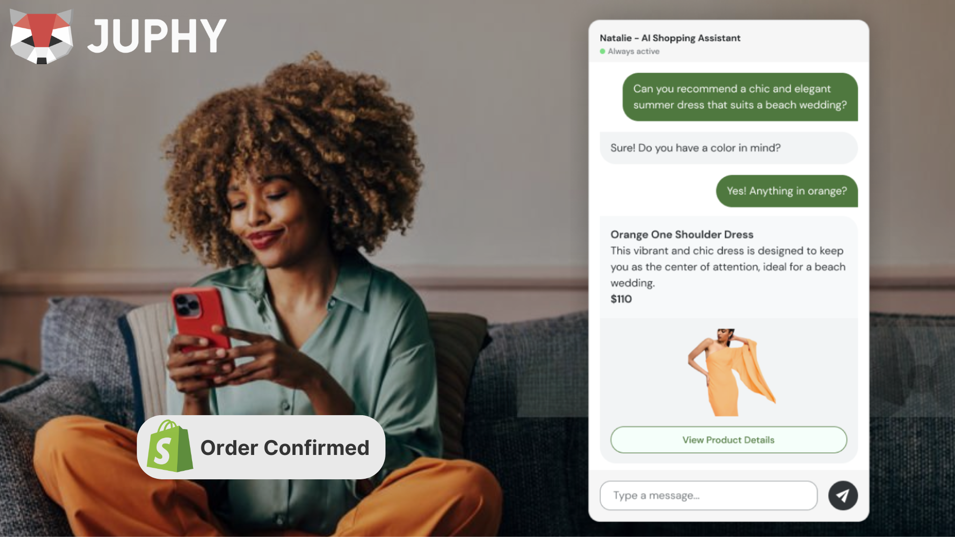
Lastly, Kith must improve its customer service to enhance its customer experience. Integrating an intelligent chatbot is a simple fix for this. If we ask an intelligent chatbot like Juphy the “Do you ship to Italy?” question, it’ll give a human-like response like,
“Hello! Yes, we do offer international shipping, including to Italy. You can select your country at checkout to see the available shipping options and rates. If you have any more questions or need assistance with your order, feel free to ask!”
In the end, you get a satisfied customer.
Final Rating
Rating Breakdown
- Product Descriptions and Collection: 6/10
- User Experience: 7/10
- Customer Service and FAQ Page: 6/10
- Return and Shipping Policies: 8/10
- Promotions and Discounts: 8/10
- Special Features and Innovations: 7/10
Overall Rating—7/10
Kith is a popular brand with a simple and minimalist website design that makes its products stand out. Their product organization is top-notch, even with the wide variety of products they offer. With a little effort in their product descriptions, blog, and customer service, the brand can significantly improve its customer experience.
What Can Juphy Do for Your Shopify Store?
Juphy is the intelligent chatbot you need to enhance your customer service.
It’s powered by the latest GPT-4 technology to provide human-like responses to customer queries. What’s more? Juphy’s AI Agent replies instantly so that customers can quickly get the answers they need to make informed decisions. Plus, with its ‘Built for Shopify’ badge, it can be easily accessed directly from the Shopify dashboard.
If you have AI responding to your customers intelligently, it translates to reduced customer support costs. Also, your live agents can finally take a break from the overwhelming number of queries they get. Plus, it’ll make it less likely to miss important queries. Juphy frees up time for your agent to focus on more relevant tasks.
Juphy’s AI Agent can also help with product recommendations. For example, it can suggest matching shorts to a customer buying a t-shirt. This increases your average order value.
With that said, if you’re ready to collaborate with Juphy to get more satisfied customers and improve sales, click here to begin your free trial now.