Beis Review: Make Your Every Day Easier
Glory-Anna Oshafi
Beis is a multimillion-dollar travel brand celebrated for its stylish and practical bags that make travel seamless. The brand also has a simple yet functional website that effectively delivers the brand message, shows its products, and enhances the shopping experience. A feature that drew our attention was the captivating visuals on the website. They include clear images and creative videos that show the products in action. There’s more to learn about the Beis website, which we’ll uncover in our Beis review.

Comprehensive Features Analysis
Our Beis review touches on various aspects of the website that shape the shopping experience. We’ll start with product descriptions, followed by a look at the user experience and customer service, down to other standout features the site offers.
Product Descriptions and Collections 8/10
Product descriptions play a vital role in driving purchases on any e-commerce website. Let’s discuss how Beis leverages this feature using the following criteria:
- Clarity and Descriptiveness
Beis product descriptions clearly explain their products’ features in an easily understandable way. See the description of the beige luggage in the image below.
They also include highlights and icons to distinguish the product’s major features. Additionally, the descriptive details about the product’s appearance and accurate expectations.
However, they use technical jargon like compression technology and tonal hardware, which can make it challenging for an average reader to understand. Language simplicity enhances clarity, so there’s room for improvement with that.
However, we see a better description of the purple crossbody bag.
The description uses much simpler terms. However, there’s a focus on the product features rather than the benefits. Benefit-focused product descriptions are more persuasive.
For example, to shift the focus of the product description of the crossbody bag toward benefits, the description could emphasize how the features improve convenience, comfort, or style for daily use. This will resonate better with the target audience.
- SEO vs. Readability
Beis product descriptions strike a balance between readability and SEO. However, there’s room for improvement in both areas.
For readability, we commend the casual and conversational tone they use for the descriptions. It makes them readable and relatable. But some descriptions are packed with features. This may make it sound technical and dull the impact of the overall content. Other than that, they’re good.
As regards SEO, they could use more keyword optimization for better SEO performance. The brand already has great products to offer. Investing in SEO only makes them more visible to potential customers on the internet.
- Creativity and Branding
Beis’ creativity is reflected in their product presentation and naming. For instance, the name for the crossbody bag we featured earlier is The Carryall Crossbody. The ‘Carryall’ in the name indicates that it can accommodate all your on-the-go essentials, like a water bottle.
They also play on their name for products like The Beisics Laptop Pouch, shown below.
Also, something about the “The” they include in every product name gives it a dramatic tone when said aloud. It also makes it sound like a luxury, a rare piece.
Furthermore, the website reflects the brand’s image, which centers on a blend of style and practicality. Plus, using soft colors and a simple layout gives off a contemporary vibe that resonates with modern audiences, who are arguably their target audience.
So, for creativity and branding, Beis deserves an A+.
- Organization of Collections
Beis offers various products as a travel brand that meet every traveler’s needs. They have collections for luggage, crossbody bags, totes, accessories like makeup & cosmetics bags, laptop pouches, and more.
The brand has efficiently organized these products to ensure customers find specific products seamlessly.
Firstly, they organize the products into general terms in the menu, such as luggage, bags, and accessories. Refer to the image above.
Customers who want to browse the entire collection can click “Shop All.” Also, there’s another menu item that lists second-hand Beis products. Another fascinating thing about their organization is the option to shop by color.
Aesthetics matter for the modern-day traveler. Beis understood this and created a way for customers to quickly find products in their favorite colors.
- Visuals
The standout feature of Beis’ visuals is that they show their products in action using clear and crisp videos. Their visuals can inspire you to buy the product and pack your bags for your next vacation if only to show off the new product.
User Experience 9/10
One of the first attractions of the Beis online store is the clean and simple layout of the website. Their color choices also give the website an airy and calmly captivating feel. Then navigation is easy. Whatever you need, you can get by intuition from the menu.
Also, customers can search for items on the website with the search function. They even suggest popular searches and trending products to give customers insights into what others are buying.
In addition to the search function, Beis offers a sorting function that gives customers control over how they view products.
Also, customers can apply filters to narrow their search to their preferences.
This improves the user experience because it helps customers find what they’re looking for faster. It also encourages conversions, as customers may likely buy when they can easily find products that fit their criteria.
Beis’ website, although simple, has features that effectively contribute to a positive user experience.
Customer Service and FAQ Page 8/10
Organization is important to Beis. We see that in their organization of collections and now, in the arrangement of their FAQs. The questions are categorized into different topics like order questions, pre-order questions, reward questions, etc.
Additionally, the page is not congested with information as they incorporate the accordion design to hide answers. This allows customers to scroll through the length of the page and find answers quickly.
A highlight of the FAQ page is the email support they offer a couple of times throughout the page for customers who require extra support.
The only downside is that their email support is limited to Monday to Friday from 9 a.m. to 5 p.m. PST. In addition to the support email, they also provide a form on the contact page for customers to send in their queries.
Beis offers traditional means of customer service. However, that’s not enough for the modern-day shopper. You can lose your customers to competitors if you can’t provide fast and efficient customer service. This is why chatbots are the trend these days. Perhaps it’s time Beis looks into that.
Return and Shipping Policies 8/10
Every product page has a dedicated shipping & returns section that hyperlinks to the dedicated pages for both policies.
This improves access because having everything you need from the product page of the item you like is convenient. No searching the site aimlessly trying to find “returns & shipping.”
Although customers can also easily access these policies via the website’s footer.
The shipping policy page provides comprehensive details about shipping and delivery. The font size is legible, but the texts need better organization. Using bullet points to highlight important information or organizing it with headings can make skimming the policy easy.
The returns & exchange policy, on the other hand, has fewer texts, so it’ll be easier to spot relevant details. However, the bullet point suggestion still stands because it’s faster to pass vital information.
Promotions and Discounts 8/10
Beis uses a banner to advertise their free shipping offer on others above $150. They also offer a rewards program where customers gather points and redeem them for discounts or products.
Another avenue for saving is the second-hand Beis collection with fairly used but cheaper products. At the time of this review, these were the only options the brand offered for cost savings when buying Beis.
Special Features and Innovations 9/10
The review section on every product page is an innovative feature. When potential customers read positive feedback from others about a product, it influences them to buy.
Additionally, there are filters to customize the reviews. For example, customers can choose to see reviews about the product materials, color, size, quality, or other relevant characteristics of the product.
Customers can also choose to see reviews alongside the product’s picture from the reviewer’s camera. This customization enhances the user experience and builds trust.
Strengths Showcase
Some of the strengths of the Beis brand include:
- Product Presentation
Beis excels in showcasing its products with visually captivating images and creative videos. They highlight products in real-world use to inspire customers and help them visualize how the bags will be functional for their travel routine.
- Functional Designs
Another selling point of Beis is its practical designs. They design each product with the practical needs of travelers in mind without compromising on style. This combination is attractive, and the website does an effective job of showing it.
- Website Layout
The clean and minimalist layout of Beis’ website is unmatched. It’s simple, user-friendly, and well-organized to help customers navigate the site smoothly. Another perk of the clean design is the spotlight it puts on the products. Nothing else distracts users from the item’s features.
Growth Opportunities for Beis
While Beis is already popular for its sleek designs, it needs to improve its customer service. Many competitors are waiting to snatch up your customers if you can’t provide fast and efficient customer support whenever they need it. It’s not enough to just provide an email or phone number. The brand needs a system that can provide instant responses at any time of the day.
Final Rating
Rating Breakdown
- Product Descriptions and Collection: 8/10
- User Experience: 9/10
- Customer Service and FAQ Page: 8/10
- Return and Shipping Policies: 8/10
- Promotions and Discounts: 8/10
- Special Features and Innovations: 9/10
Overall Rating—8.5/10
Beis is arguably among the top brands offering practical solutions for travelers. With many positive reviews across the website and other third-party reviewers, the brand is set to take over the travel industry. However, they must provide an efficient means of customer service to beat the competition. Luckily, when it comes to customer service, nothing does it better than Juphy.
What Can Juphy Do for Your Shopify Store?
Fundamentally, there are three things Juphy‘s AI Agent, featuring the ‘Built for Shopify’ badge, can do for Beis and other consumer-driven e-stores.
Increase Sales Through Personalized Recommendations
With all the data Juphy collects about customers, it can recommend products to complement the customer’s order. For example, Juphy can suggest a makeup pouch to a customer shopping luggage for their next trip.
Also, when there are new additions to a customer’s favorite shopping category, Juphy can suggest the product to the customer the next time they visit the site. Essentially, Juphy’s AI Agent facilitates decision-making through its recommendations, thereby increasing sales.

Improve Customer Service
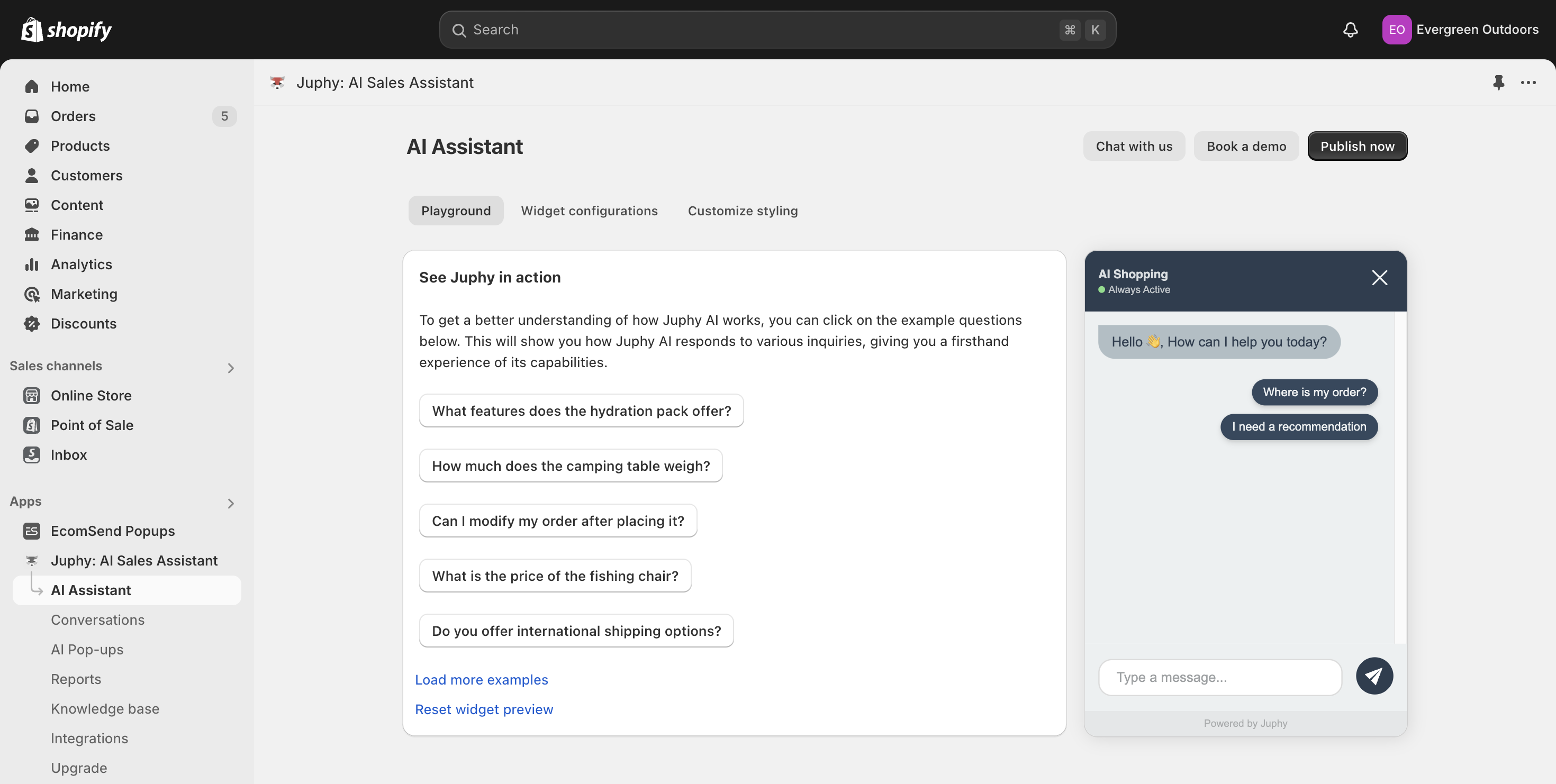
Juphy’s AI Agent provides instant responses to customers’ queries. It accesses all your website’s data and offers accurate answers to customers. Also, Juphy AI doesn’t have working hours; it’s available 24/7.
In addition, it’s powered by modern technology to understand complex queries from customers and generate intelligent responses based on the data from your website.

Providing immediate and intelligent responses with Juphy boosts customer satisfaction and increases conversions.
If this sounds good, you’re just a few clicks away from integrating Juphy’s AI Agent into your online store. Try the free trial now.

